The report lets you show your data on a map, which is particularly useful for these kinds of stories:
- Where specific brands are most popular
- How many prospective customers live near your business locations
- Which regions have the most of a certain kind of population (for example, the most vegetarians, or parents of toddlers, or Lexus drivers, or any other information included in your uploaded or syndicated datasets).
The map visualization shows the data from your report plotted against a geographic background image, as seen in the following graphic.
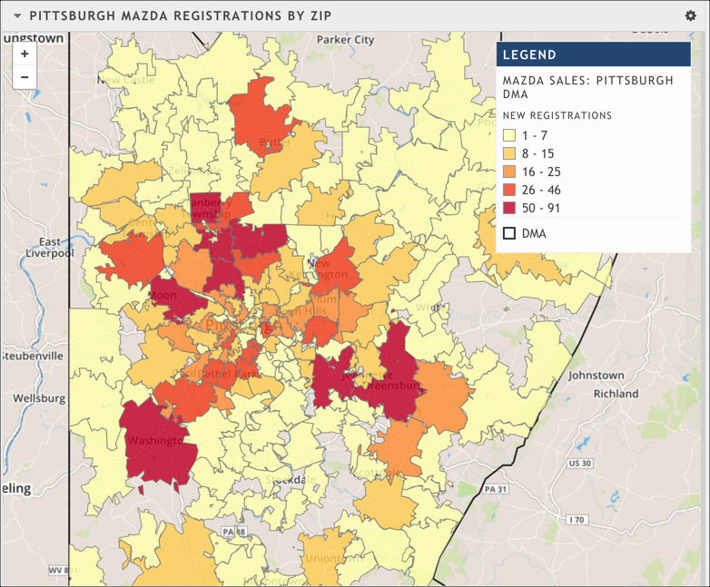
A map visualization
Map requirements
If you want to use a map visualization, make sure meet the following requirements:
- You are using a dataset with geographic information (for example, it contains at least one geographic type, like ZIP Code or County or State).
- You select a grouping that aggregates your data by geography.
If you don't have geographic data to show or aggregate by, your map will be blank.
Map configuration options
By default, the background shows a map with roads, political boundaries, and basic geographic features. You can use any of the following controls to customize the basic size and background. d
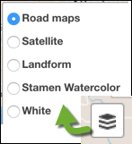 | Use the map background controls to determine what you want to show on your map. Perhaps you think that seeing roads makes it too busy; in that case, choose the Landform option. |
 | Use the zoom controls to adjust the zoom level of the map. (Alternatively, double click on the map to zoom in on that area.) |
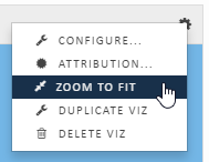 | Use the Zoom to fit option from the visualization menu to automatically size the map to fit whatever data you are displaying. |
To configure other aspects of your map, use the Configure option under the map visualization's gear icon. The configuration dialog box gives you control over which data series you display on the map and how the data should be ordered, grouped and visualized. You can also opt to show a legend.
General tab
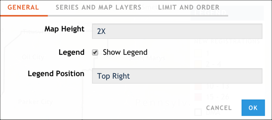
The General tab of the map configuration dialog box
The General tab of the configuration dialog box allows you to control the size of the map, whether you include a legend, and where that legend is displayed.
Series and Map Layers tab
The Series and Map Layers controls which data series and vector layers you display on the map and how the data should be ordered, grouped and visualized.
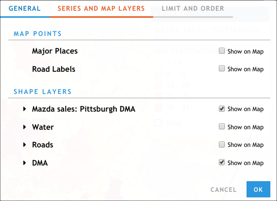
The Series and Map Layers tab of the map configuration dialog box
Notice that, by default, only the data series appear on the map. You can add additional layers by clicking Show on Map.
Use the drag and drop option to reorder your data series to show the most important item on top. The first series forms the top layer of the map; in many cases, this layer hides any information that appears underneath it, so be sure to configure your order carefully.
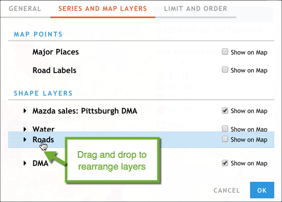
Reordering layers in the Series and Map Layers tab of the map configuration dialog box
Layer configuration options in the Series and Map Layers tab of the map configuration dialog box Each shape layer can be configured to specify how it's displayed on the map. To access the options, click the arrow icon next to the layer. The graphic below shows the configuration options available for the Mazda Sales: Pittsburgh DMA data series layer.
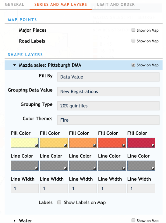
Layer configuration options in the Series and Map Layers tab of the map configuration dialog box
Let's delve into a few of these configuration options:
- Fill By: Use this to indicate how you want to color your map.
- Uniform: All regions in this data series are the same color. You can pick the color you want.
- Unique: Each region in this data series is a randomly assigned, unique color.
- Data value: Each region is colored according to an attribute of the data you set; it's used in conjunction with the Grouping Data Value field below. Use this option to create striking data-driven colors on the map. You can pick the color scheme you want. gives you complete control over the colors and line weights in the map.
- Grouping Data Value and Grouping Type: If you opt to fill your map based on data values, you need to indicate what data values you want to see. Use the Grouping Data Value and Grouping Type fields to indicate the value you want to group (for example, the number of new registrations, or the proportion of new registrations) and how you want to group them (for example, 20% quintiles, Jenks breaks, equal counts). (Read Data Grouping Options for details.)
- Color Theme: You can choose a preset theme for your map coloration, or use the Fill Color, Line Color, and Line Width options to create a custom color theme.
- Legend Direction: Sort the legend in ascending (lowest or lightest-colored values first) or descending (highest or darkest-colored values first) order.
- Label: Use this to display labels on your map. Be warned: If you have a lot of data or geographic areas on your map, the labels can overwhelm the visualization.
Limit and Order tab
Use the Limit and Order tab to control how much data to show on the map and in what order.
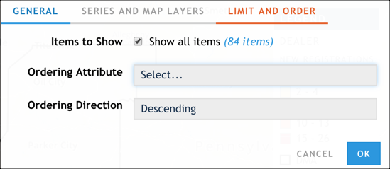
The Limit and Order tab of the map configuration dialog box
The options in this tab are useful when you want to focus your visualization on perhaps the top N or bottom N values for a particular attribute. For example, perhaps you want to emphasize which regions have the top 15 highest new Mazda registrations. By default, all items are shown. Clear this option to specify a certain number of items to show.