Bar chart and column chart visualizations let you compare categorical data values in your report with a colorful and easy to understand graphic visualization; the height or length of the bars indicate their value. In the report, bar charts and column charts have the same configuration and capabilities.
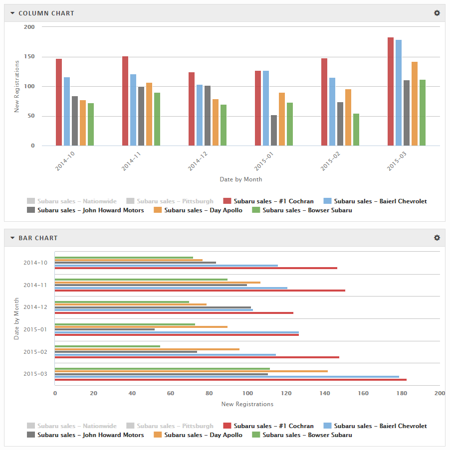
Column chart and bar chart used to visualize the same data
The choice of a vertical or horizontal chart is mainly based on personal preferences. As you can tell from the figure above, some data fits better in one form than another. When deciding which kind of chart to use, consider these issues:
- Length of the labels on your data bars. Long labels fit better on a bar chart than a column chart.
- Type of data. If your figures represent vertical measurements (like elevations, heights, or size), a column chart seems more appropriate. If your figures represent chronological progress, a bar chart might make more sense.
- Data values. Would you like to show negative values below the zero line (column chart) or to the left of the zero line (bar chart)?
- Number of items to include. As of the current release, the bar chart has a height constraint that can make it difficult to show a large number of items. (Rhiza is investigating solutions for this issue.)
You can hover over a column in the chart to see more data about it:
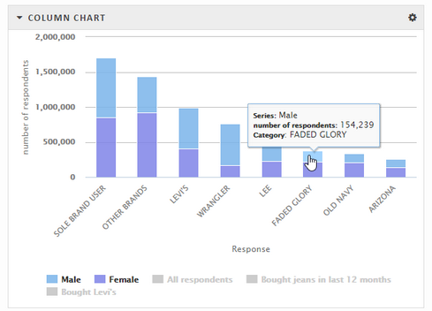
Hover over a column to see more data
Bar charts can also represent more than just the two values of grouping and value. In the example below, a stacked bar chart shows two values for each grouping.
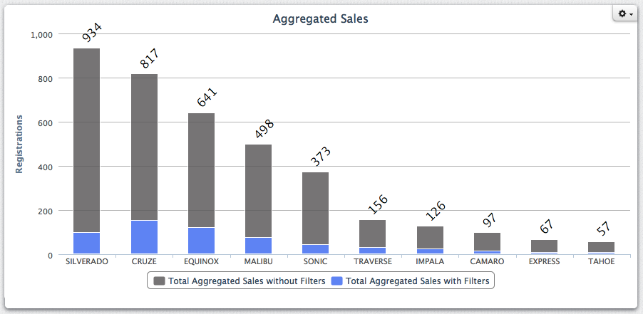
This chart shows vehicle registrations for each car model sold by a particular auto dealer. The height of the light blue rectangle shows the number of registrations for vehicles that this dealer sold. The height of the grey rectangle shows the total number of registrations for that model, regardless of who sold them.
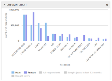
Caution: When using the Stacked or Percent option, it's possible to create a misleading visualization by charting data series that overlap with each other. For example, the presentation used in the following graphics has a data series for people who reported buying Levi's jeans in the past 12 months. These respondents also should have answered yes to the question in the "Bought jeans in last 12 months" data series, so the two data series contain at least some of the same individual respondents. These two series also most likely overlap with the "Male" and "Female" data series. Showing the overlapping data series in a stacked or percent chart means that some individuals will be counted twice. The Stacked and Percent options should only be used to show data series that are mutually exclusive.
Clustered column chart (separate bars for each data series in each category are aggregated by the grouping value)
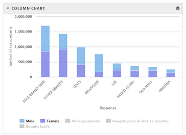
Stacked column chart (each category has one bar that is portioned into data series values)
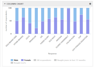
Percentage column chart (one bar for each category is portioned to show the percentage contributed by each data series; bars are equally sized at 100%)
Chart download option
You can also download a chart as a portable network graphics (PNG) file. Click the gear icon and click Open as png. A .png format image of the chart will open in a separate browser window so you can save it to your computer.
Chart configuration options
The configuration settings between the two chart types are nearly identical, except that the X- and Y- axes are switched. A generic way to refer to the axis that shows the data series is the category axis (the Y-axis on a column chart and the X-axis on a bar chart). The axis that shows the numeric values can be called the value axis.
Configuring a chart visualization
Configure column charts