A line chart displays information as a series of data points on an axis. Each data point represents an individual measurement or piece of data, and the points are connected by a line to show a visual trend.
Line charts frequently are used to show a trend in data over time.
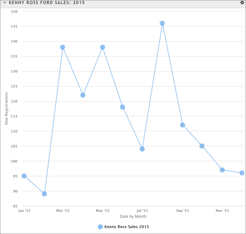
In the example above, the number of auto sales for a single dealer (vertical axis) is plotted against time (horizontal axis). You can hover over any point on the chart for more information.
A line chart can also be used to plot more than one data set at a time, and can be used with a context series to show an index.