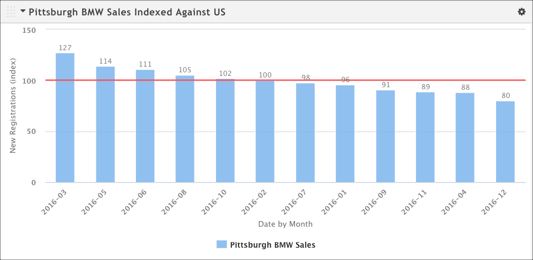
In many cases, indexes tell a useful comparison story. How is my dealer doing compared to the local market? How does my target compare to the overall population?
You can add an index to a bar or column chart with the help of a context series (a specialized target series that defines the larger market or population you want to compare your target against).
Make sure you have created your target series and context series and linked them. See Create an Index with a context series.
Open the configuration dialog box for the chart you want to add the index to.
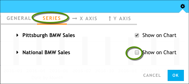
On the Series tab, make sure only your target series is being displayed. If necessary, clear Show on Chart next to the context series. We want it to be represented as an index line, not as a bar on the chart.
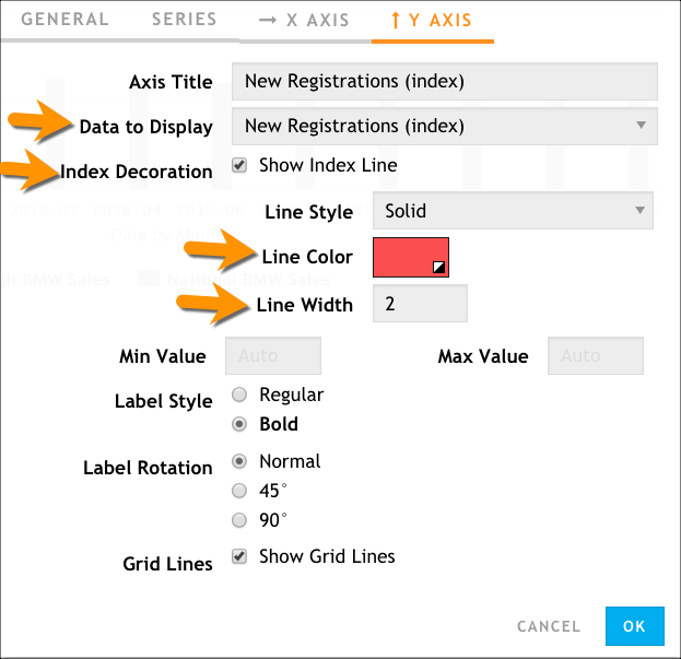
On the Y AXIS tab (for a bar chart, the X AXIS tab), make the following changes to enable the index line to display:
- Change the value of Data to Display to the index calculation (in this example, it's New Registrations (index)).
- Enable the Index Decoration > Show Index Line option.
- Set values for the Line Color and Line Width options.
Click OK.