By default, a map visualization displays all geographic target series and fills the geographic regions by either new registrations (for a dataset like IHS Polk New Registrations) or respondents (for survey-style datasets). You can control the content and the visual aspects of a map by using its configuration options.
Each time you add a target series with a new mappable element -- the entire target series, a geographic shape (e.g., a DMA or an ad zone), or a mappable point (e.g., an address) -- the map is updated to include that new element.
Add a map visualization to your presentation. The default map visualization might look something like this, if you selected the map-based grouping State.
Open the map configuration dialog box by clicking Configure under the gear icon. The dialog box opens to show the General tab.
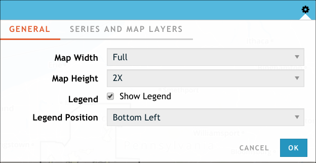
Optionally, adjust the height and width of the map.
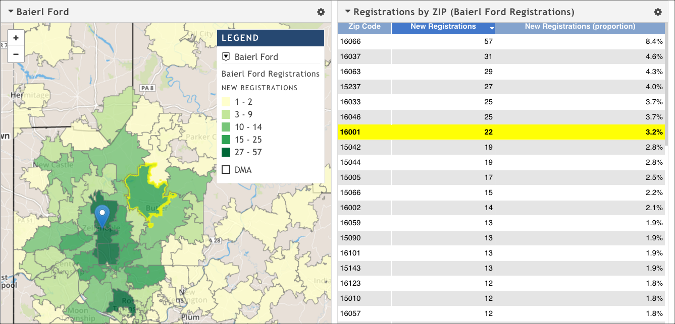
Sometimes it's useful to make the map less than full width so that you can place a complementary visualization (often a table with detailed data) next to it. Maps and tables enjoy coordinated marking, which means that if you highlight a data point (for example, a ZIP code) on a map, the corresponding ZIP code entry is highlighted in the table visualization. This approach allows you to see the specific data associated with a shape on a map without cluttering the map with labels.
Optionally, adjust the settings for the map's legend. You are able to change the map legend's position (upper left, upper right, lower left, lower right).
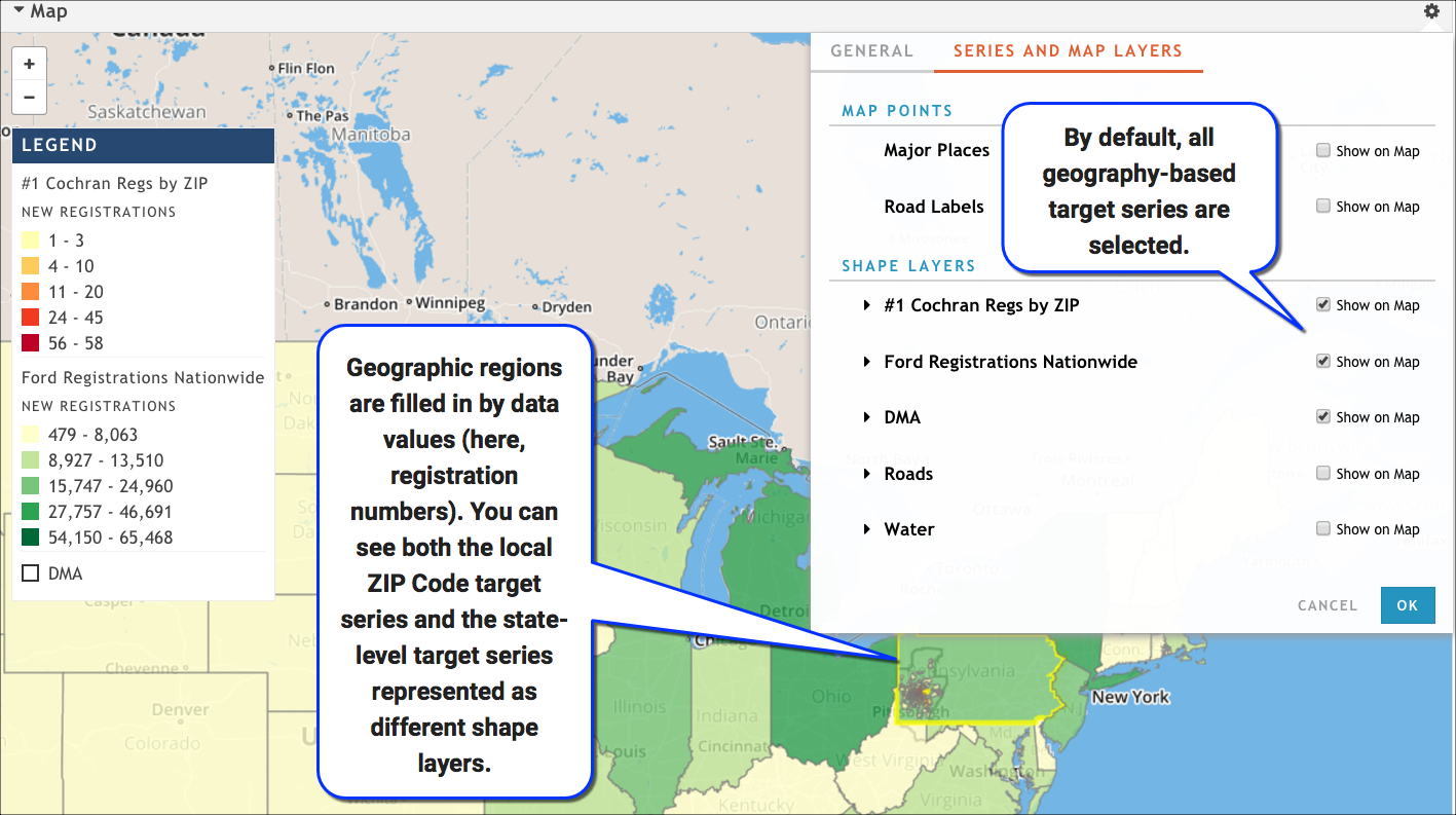
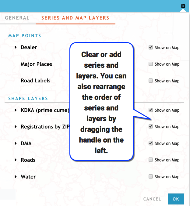
On the Series and Map Layers tab, clear anything that you don't want to see on the map by click the check box to the right of its name. By default, all target series with geographic elements are selected, as are any geographic shapes (DMAs, ad zones) or mappable points that you created in your target series.
Customize the way the each data series is displayed on the map.
Expand the target series name.
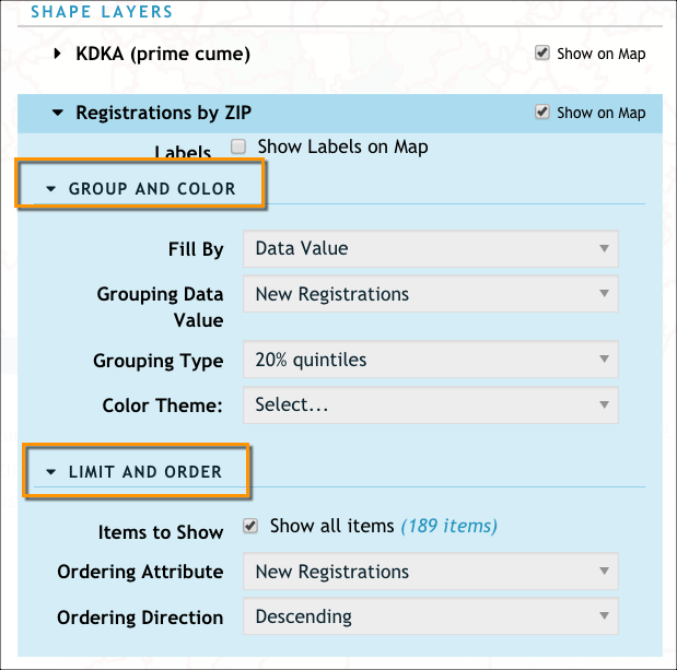
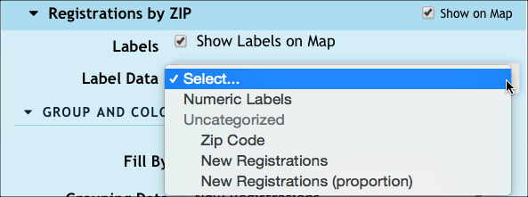
If you want to show labels for your target series, click Show Labels on Map, and then use the Label Data menu to indicate the kind of label you want.
Expand the Group and Color section.
Use the Fill By menu to specify how you want the map to color the data.
Uniform All shapes are colored uniformly regardless of the data. You can use this option to change the fill and line color and the line width. Unique Use this option to give each shape a unique, randomly assigned color, regardless of the data. Data Value Use this option to color shapes depending on the value of the data they contain. Darker colors show higher data values.
If you select this option, you also need to specify values for these related options:
- Grouping Data Value: The value (raw or calculated) you want to use to group and color the data (for example, Target Persons, New Registration, New Registration Proportion).
- Grouping Type: The way you want to break -- or group -- the data (for example, 20% quintiles or equal counts)
- Color Theme: The color palette you want to use for the data
- Legend Direction: Sort the legend in ascending (lowest or lightest-colored values first) or descending (highest or darkest-colored values first) order.
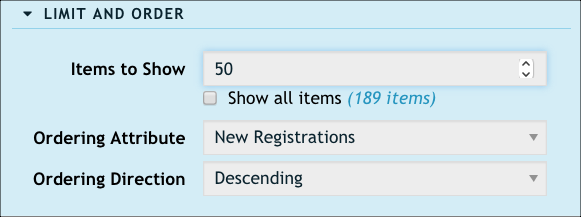
If you want to limit the number of shapes you see on the map (perhaps you want to see only the top 15 ZIP codes where a dealer sells into), expand the Limit and Order section and use these options:
Items to Show: Clear this and then specify exactly how many items you want to see
Ordering Attribute: Pick the data measurement you want to use (for example, new registrations, target persons)
Ordering Direction: Specify whether you want to see the top results (descending) or the bottom results (ascending)
Add any additional layers you want to see on the map (such as roads, water, or major places) using the display layers toggle in the lower-right of the map visualization.
Click OK when you are done customizing your map.