By default, new visualizations are placed at the top of your presentation. They have a full-screen width and a default size of 1.00X (the exception is the map; it defaults to 2.00X).
Drag and Drop
As you start adding more visualizations to your presentation, you'll likely want to change the sizes and positions of at least some of them so they tell your story in the order you think is most appropriate. The drag-and-drop positioning in makes it a snap to move tables, maps, and charts around.
If you place your visualizations next to each other in the browser, that layout will not be preserved in the generated PowerPoint. Each visualization is placed on its own slide.
Resizing
You can adjust the height and width for any visualization you add to your presentation.
Keep in mind that any adjustments you make to the height and width are reflected in the PowerPoint output. Each slide has only one visualization, but that visualization is scaled according to the height and width you assign to the visualization. For more information, see Generate a Microsoft PowerPoint version of your presentation.
Customizing the height
All visualizations come in a range of heights.
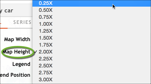
1.00X is the default for everything except maps (2.00X is the default for maps). The largest size is 3.00XYou can use a mix of sizes within the same presentation to help you achieve a good visual balance and to ensure you are showing the data to its best effect.
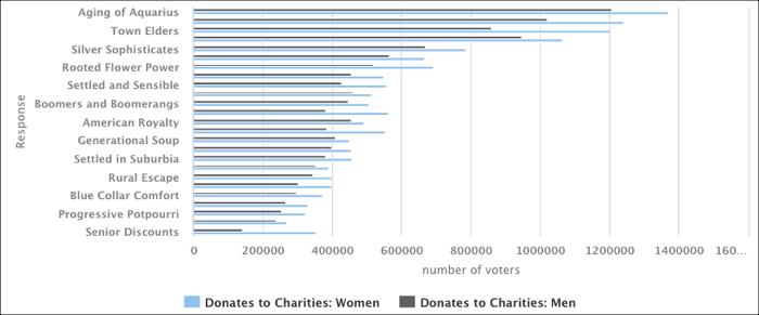
To illustrate how height can make a difference in the data you show, consider the following bar chart, which has a lot of items on the Y-axis. It's shown at 1.00X height (the default size):
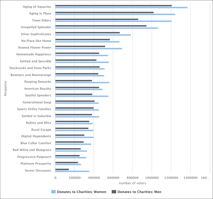
If we configure the same bar chart to use a height of 2X, the data becomes much more readable, and none of the data points are lost:
Customizing the width
By default, all visualizations have their width set to the full size of the presentation. However, there are many times when you might want to show visualizations next to each other; the ability to customize the width lets you do this.
For example, imagine you wanted to show a map visualization with a dealer and the ZIP Codes the dealer sells into. You could put the actual registration data numbers for each ZIP Code on the map, but the map would look cluttered. Instead, you can add a complementary table visualization that shows the detailed registration information for each ZIP Code and place it next to the map. You could set the map's width to half and the table's width to half, and end up with something similar to the following:
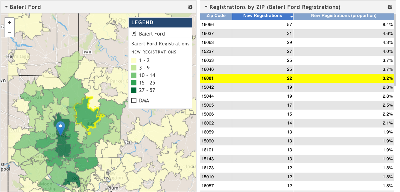
Notice that you can highlight a ZIP Code on the map or on the table and see its corresponding entry highlighted in the other visualization.