Column charts are one of the most versatile visualizations in Rhiza. A little known secret: You can turn a regular column chart into a line chart with just a few clicks of the mouse! (We'll show you how in an example at the end of this topic.)
The steps for configuring column charts are similar to configuring bar charts, with just a few differences on the X-axis and Y-axis.
Chart Style
From the column chart's gear icon, click Configure to open to configuration dialog box. By default, it opens to the General tab.
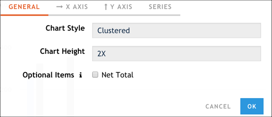
In the Chart Style field, either accept the default style (Clustered) or select Stacked or Percent.
Select the chart height.
If you want to display a net total column in your chart, click Net Total.
X-Axis
Configure the chart's X-axis by clicking the X Axis tab and doing the following tasks.
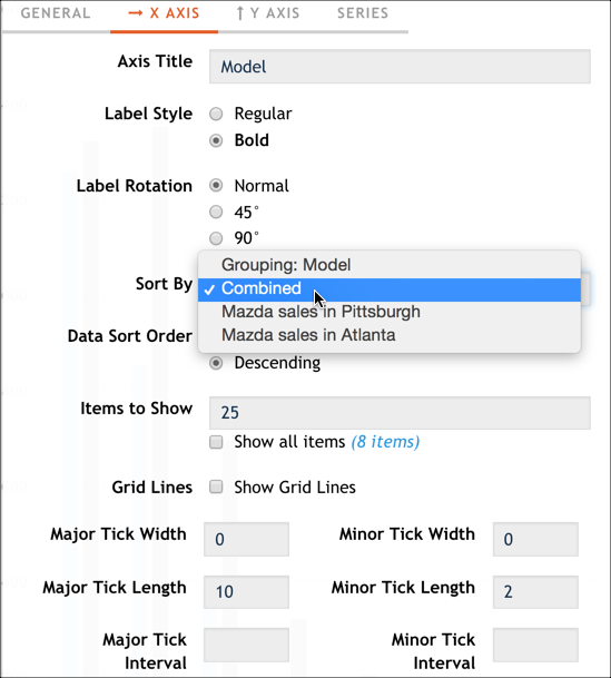
Update the Axis Title field to reflect the X-axis title you want to see.
Optionally, adjust the values for Label Style and Label Rotation.
Use the Sort By and Data Sort Order options to customize what data you want to see on the chart and in what order. You can sort from top down (descending) or bottom up (ascending), and you can sort by series, by category, or by all series and category combined. We recommend you experiment will all the combinations to see the different results you might get.
Specify the number of items you want to see in the chart:
- Use the Items to Show field to limit the number of bars in your chart. For example, if you choose to show five items, and you've selected a descending sort order, you'll be representing the top five items in your results.
- Use Show all items to include all data points in the chart.
Adjust the options for showing grid lines and tick marks.
Y-Axis
Configure the chart's Y-axis by clicking the Y Axis tab and doing the following tasks.
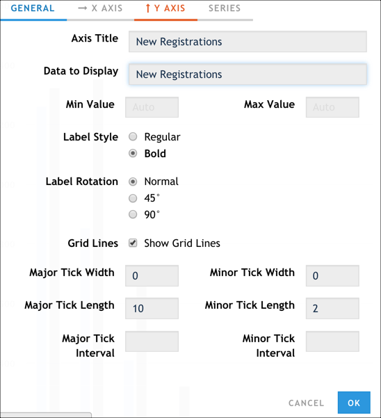
- Update the Axis Title field to reflect the Y-axis title you want to see.
- In the Data to Display field, select which data value you want to see reflected in the columns of the chart.
- Use the Min Value and Max Value fields to establish the top and bottom values to show on the chart. This can be helpful if the lowest value you have is, for example, 5,000.
- Optionally, adjust the values for Label Style and Label Rotation.
- Adjust the options for showing grid lines and tick marks.
Data Series
Configure the chart's data series by clicking the Series tab and doing the following tasks for each series.

- Expand the data series.
- If you don't want to include it on the chart, clear the Visibility check box and skip to step 7.
- By default, the data series is represented as a bar. If you want to change it, select a new visual representation in the Series Type field.
- Use the Labels, Label Style, and Label Rotation options to customize how you want the bar's labels to appear.
- Click the swatch of color in the Column Color field to open a dialog box; pick any color you want for the bar.
- Click OK.