Let's create a simple presentation in to introduce you to the interface and some of its capabilities. In this presentation, we want to look at Olive Garden diners in a certain market and find out what age group eats there most often; we then want to add a second market for comparison. We'll use a column chart visualization to examine the data, and then save the presentation as a Microsoft PowerPoint file that can be shared with others.
Create a New Presentation
Log in to Rhiza.
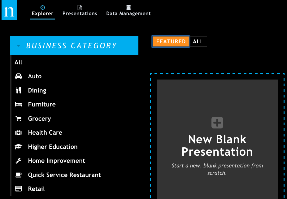
Click New Blank Presentation to start a new presentation.
When the new presentation opens, it looks like this. Note the following key areas you'll be using in this tutorial.
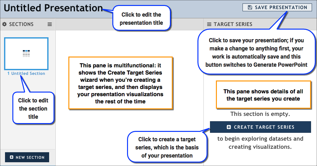
Rename your presentation:
- Click Untitled Presentation at the top of the report. The name changes to a text box.
- Type Olive Garden Diners, and click OK. As soon as you make this change, the presentation is saved and any further work you do is automatically preserved.
Rename the untitled section by clicking Untitled Section, typing Olive Garden Diners: Age, and then clicking OK.
Add Data
In the Target Series pane, click Create Target Series to open the Create Target Series wizard. This is where you will specify everything you need for your target series, including the dataset, the target, and the attributes you want to group by.
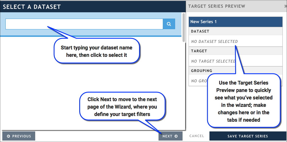
In the Select a Dataset tab, start typing Scarborough Local, then select it when it appears in the list. Click Next to move to the Select a Target tab.

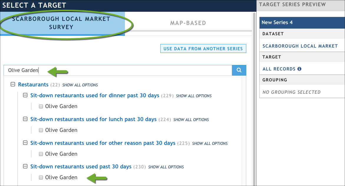
In the Select a Target tab, define the target audience -- in this case, Olive Garden diners in Atlanta.
In the Scarborough Local Market Survey sub-tab, start typing Olive Garden in the search box; the list of attributes will narrow down until only those that contain the word "Olive Garden" in a question or answer are shown.
Click the Olive Garden answer under the question Sit-down restaurants used past 30 days.
In the Map-Based sub-tab, scroll down to expand the DMA attribute, and then type Atlanta.
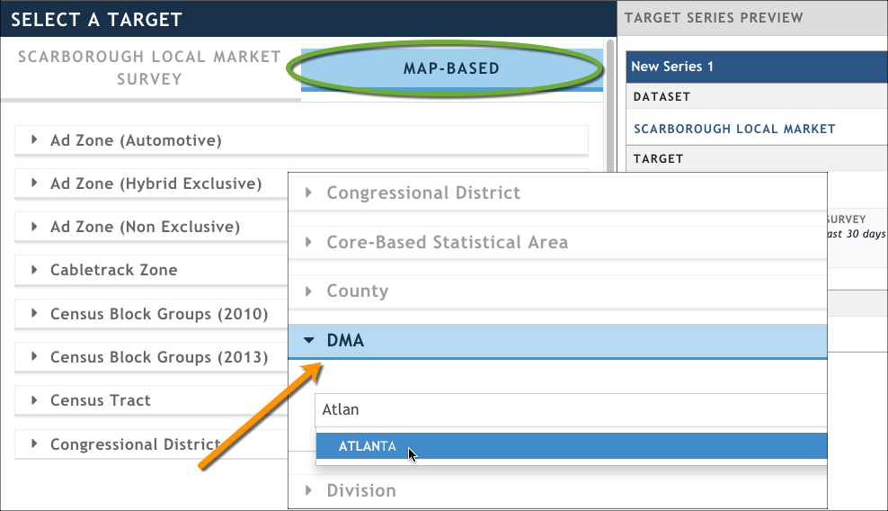
Click Next to move to the Group By tab in the wizard.
In the Group By tab, specify how you want to group -- or categorize -- the results that are returned. Here, we are going to group them by a particular question in the dataset that asks them about their age.
In the Scarborough Local Market Survey sub-tab, start typing Age in the search box; the list of attributes will narrow down until only this one is available. (Hint: If the search has trouble finding this question, you can look for it under the Personal Demographics category.)
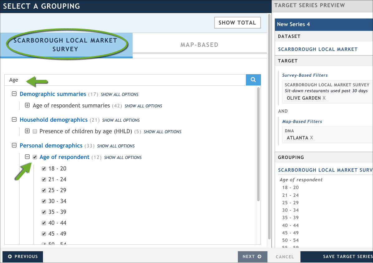
Select all of the answers.
Click Save Target Series in the bottom of the Target Series Preview area. The series configuration wizard closes and you are returned to the main body of your presentation.

After you create a target series, the Update Presentation button prompts you to update so you can see your data in a visualization
Before updating the presentation, update the target series name by clicking New Series 1 in the Target Series panel. The name turns into a text box; type Olive Garden Diners: Atlanta.
Click Update Presentation. By default, generates a table visualization by with the results of your query. (Later on, we will create a column chart to better visualize this data.)
Add a Second Target Series
Let's add a second target series so that we can compare Olive Garden diners in Atlanta with Olive Garden diners in another market. We can accomplish this quickly by using the Copy Series function and making a quick edit to the target series in the Select a Target tab.
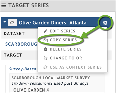
In the Target Series pane, click the gear icon next to our Olive Garden Diners: Atlanta series, and then click Copy Series. The Create Target Series wizard opens; it's pre-populated with the information from the original target series.
On the Select a Target tab, click the Map sub-tab.
Update the DMA attribute to Boston, and then click Save Series.
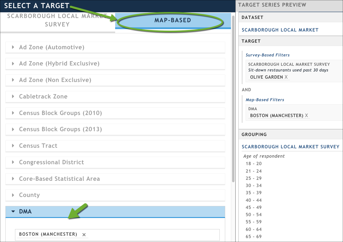
Click Save Target Series. The Create Target Series wizard closes.
Before updating the presentation, update the target series name by clicking New Series 2 in the Target Series panel. The name turns into a text box; type Olive Garden Diners: Boston.
Click Update Presentation. You'll notice that nothing happens in the visualization pane, although did create the target series and return the results. We need to explicitly add a visualization now to show both target series, so let's move on to the next section.
Visualize the Data
We have a basic table that shows the data for the first target series (Olive Garden Diners: Atlanta) we defined; in this section, we're going to delete the table and add a column chart that shows the results of both target series so that we can compare them. Note that we can do this only because our two target series use the same dataset and the same grouping. If either target series used a different dataset or grouping, we could not display them on the same chart.
Delete the table visualization:
Click the gear menu at the top right-hand corner of the table.
Click Delete Viz from the drop-down menu, and then confirm the deletion when prompted.

From the top menu bar, click Add Viz → Column Chart.

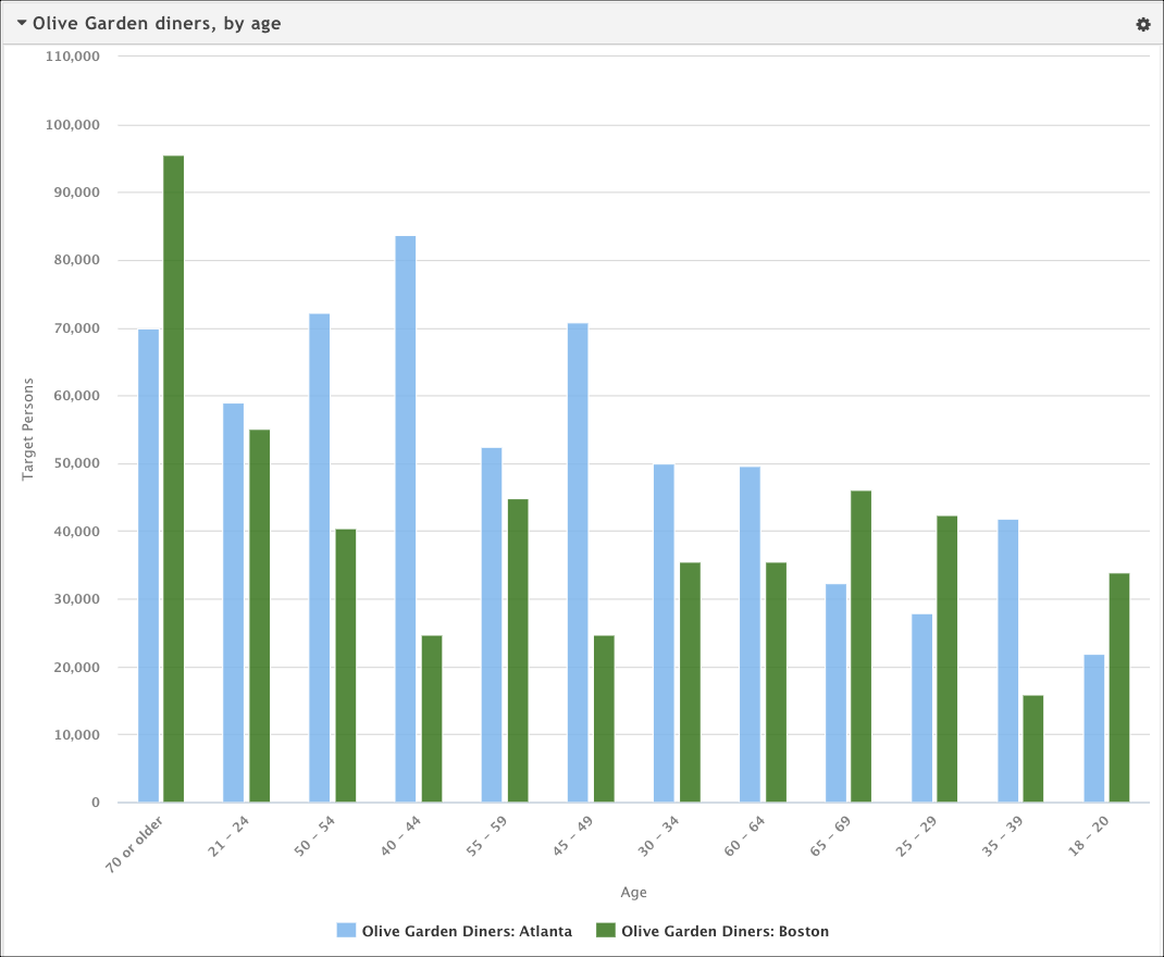
Rhiza generates the column chart to show the Atlanta and Boston Olive Garden diners grouped by age. Notice, though, that the chart needs a bit of customization. The bars with smaller amounts of data are hard to read, and the X axis is simply titled "Response." In addition, it displays the actual Respondents count rather than the Target Persons (see Nielsen Scarborough FAQs for more information) and the visualization has no title. We'll have to resolve this by using the chart configuration options.
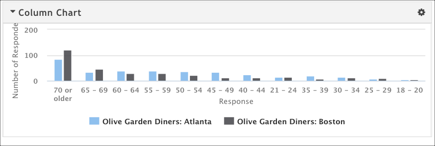
The original chart showing Olive Garden diners in Atlanta and Boston; it has some visual and data-related issues that we can resolve by using the configuration options (click t
Click Column Chart to make the title editable, and then type Olive Garden diners, by Age.
From the top of the chart, click the gear icon and then click Configureto open the configuration dialog box. This is where we'll do all of the customization work.
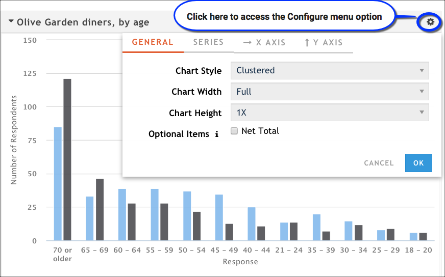
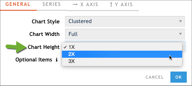
In the General tab, set the Chart Height option to 2X. This makes the chart taller and will allow us to better see those last few rows of data that were too short in the original version.
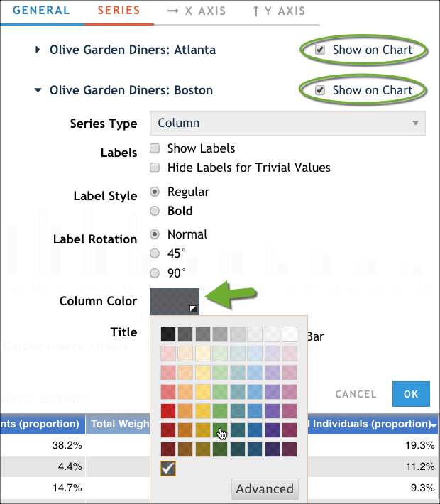
Click the Series tab, ensure that both target series are shown on the chart, and then use the Column Color option to change the Boston data series label from gray to a dark green.
In the X Axis tab, make the following changes:
- In the Axis Title field, type Age.
- Adjust the Label Rotation option to 45°.
- In the Items to Show option, click Show all items.
In the Y Axis tab, set the value of Data to Display to Target Persons. This gives us a better representation of the general population than the individual respondent count. The Axis Title field will automatically update to reflect the new value.
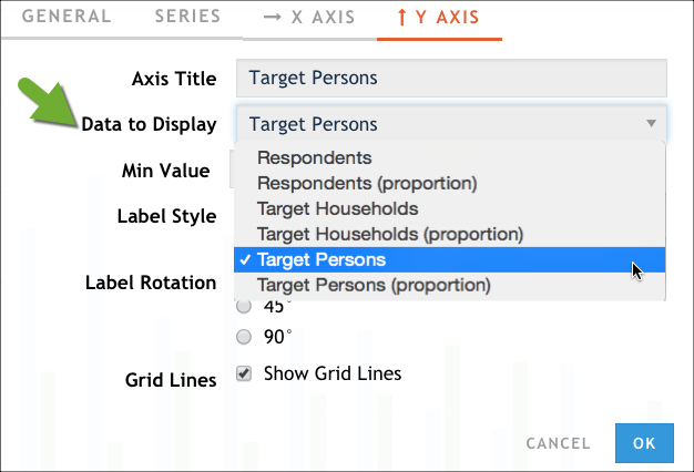
Click OK to close the configuration dialog box. The chart is updated to reflect the changes we made. Since the chart is larger, we can see all of the data better. Updated colors, titles, and label positions improve readability, too. Most importantly, we are representing the Target Persons instead of individual Respondents so that we have a better reflection of the market. If you want to see specific numbers for any column in the chart, just hover over it.
Export a PowerPoint Presentation
Create a PowerPoint version of your presentation by clicking Generate PowerPoint at the top of the screen. The column chart visualization will be rendered to fit the full size of a PowerPoint slide.
When the system finishes generating the PowerPoint, the button changes to Download PowerPoint; click that to download your presentation.
Congratulations! You've just created your first presentation. (Hint: If you want to find it later, you can always head to the Presentations tab and look for the presentation named Olive Garden Diners.)