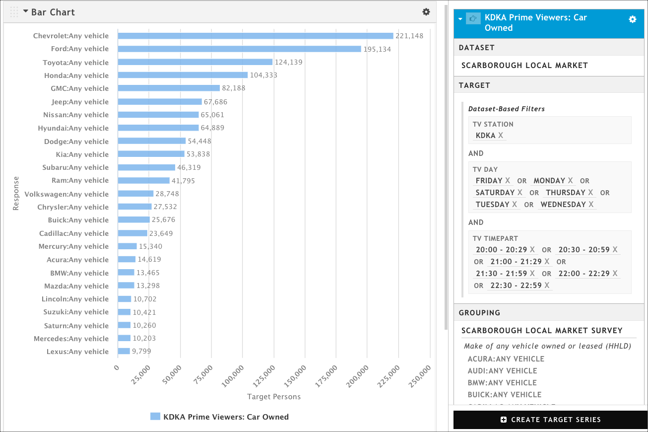
In this example, we're going to use the Scarborough Local Market dataset to create a TV daypart for a local station, then we're going to see which makes of cars those viewers are driving. That information might be useful when pitching dealerships; it can help them decide if advertising during a particular daypart will reach likely customers.
Remember that the Scarborough Local Market dataset contains diary data, so we have the TV Day and TV Timepart attributes to work with; these will allow us to create a custom daypart. In this particular example, we're going to create a Monday - Saturday 8:00PM - 10:59PM daypart for the station KDKA.
Open a new presentation.
Click Create Target Series to open the Create Target Series Wizard.
On the Select a Dataset page, start typing Scarborough, and then click Scarborough Local Market when it appears as a choice of datasets. The wizard immediately moves you to the Select a Target page.
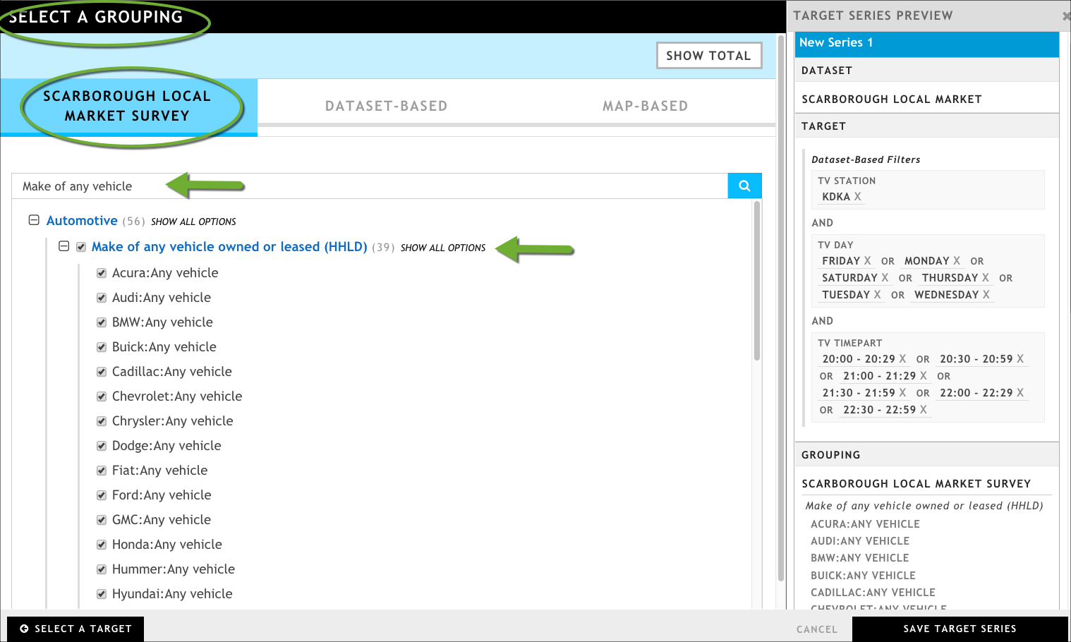
In the Dataset-based tab, define your station and custom daypart as follows:
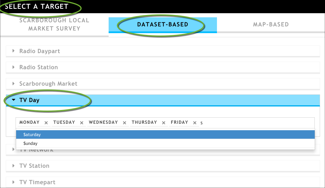
In the TV Day attribute field, enter the days of the week that you want to include in the daypart. In this case, we are going to include Monday through Saturday.
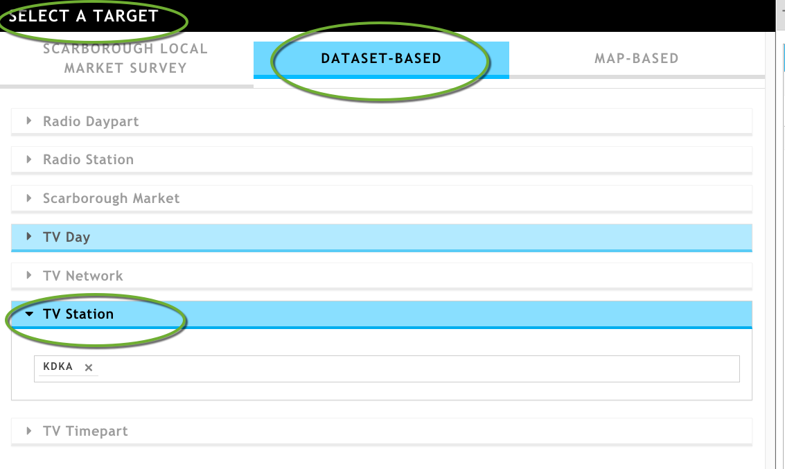
In the TV Station attribute field, start typing KDKA. The system will return matching results as you type; select KDKA by clicking it.
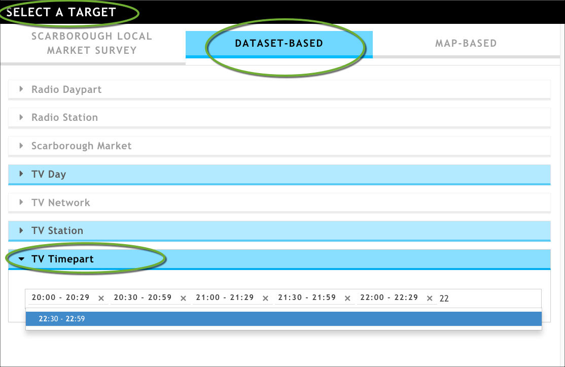
In the TV Timepart attribute field, start typing the timeparts needed to create the 8:00 PM - 10:59 PM daypart. The TV Timepart attribute values are in half-hour increments and use the 24-hour time measurement. Start by typing 20:. The system will return matching results as you type; select 20:00 by clicking it. Continue until you have selected all of the values shown in the graphic below.
Click Select A Grouping at the bottom of the wizard to move to the next page.
On the Select a Grouping page, start typing Make of any vehicle in the search bar of the Scarborough Local Market Survey tab. When the question Make of any vehicle owned or leased (HHLD) appears, select it, and all of its answers.
In the Target Series Preview Pane, rename your target series by clicking New Series 1 to make the text box editable, entering a new value, and then clicking OK.
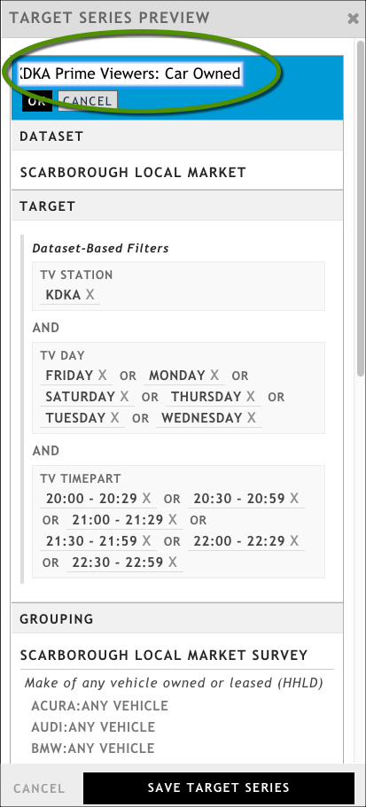
Rename a target series by clicking the default name to create an editable text box
Click Save Target Series.
Click Update Presentation. By default, a table visualization is added.
Verify that the sample size is reliable by looking at the Net Total row and making sure that the value in the Respondent column is greater than 70.
While the table provides us with good information, it might be better visualized in a chart. Click Add Viz > Bar Chart to add a bar chart. By default, the chart is too short to show the information clearly, and it defaults to showing individual respondents rather than the weighted Total Population. We'll need to do a bit of configuration.
Configure the bar chart as follows:
In the General tab of the configuration dialog box, set the bar chart's height to 3.0X. For more information, see Adding and configuring visualizations.
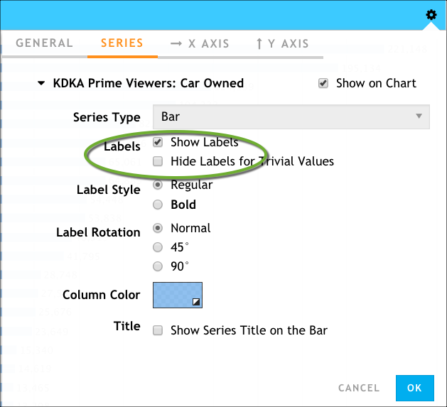
In the Series tab, expand your target series, and then click Labels → Show Labels.
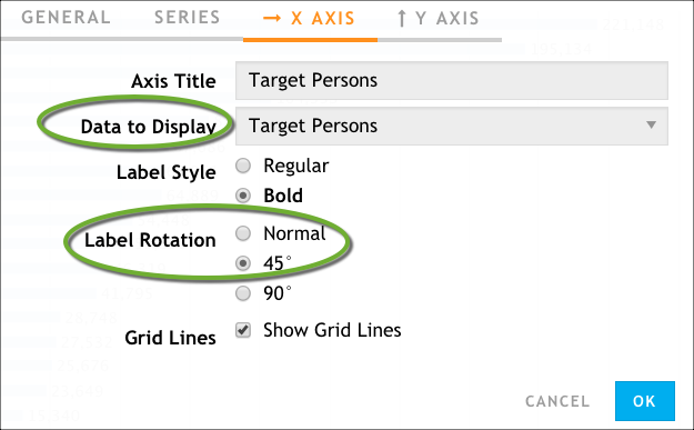
In the X AXIS tab. change the Data to Display option to Target Persons, and set the Label Rotation option to 45°.
Click OK.
The resulting bar chart looks similar to the following:
