Let's create a simple presentation in to introduce you to the interface and some of its capabilities. In this presentation, we want to see which dealers sold new BMWs during the current rolling year to date (RYTD) in the Atlanta DMA. We'll use two visualizations (a table and a column chart) to examine the data, and then save the presentation as a Microsoft PowerPoint file that can be shared with others.
Create a New Presentation
Log in to Rhiza.
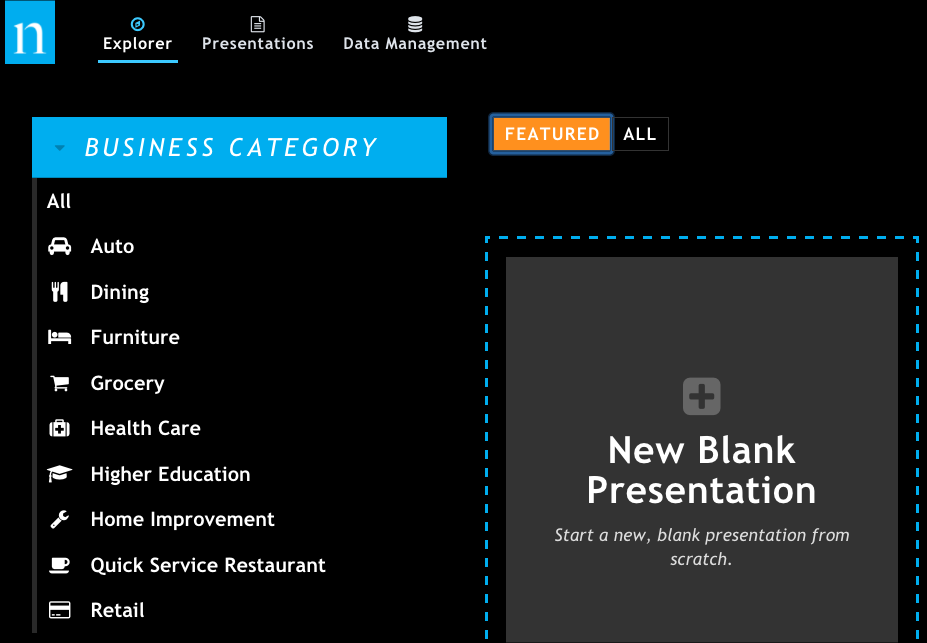
Click New Blank Presentation to start a new presentation.
When the new presentation opens, it looks like this. Note the following key areas you'll be using in this tutorial.
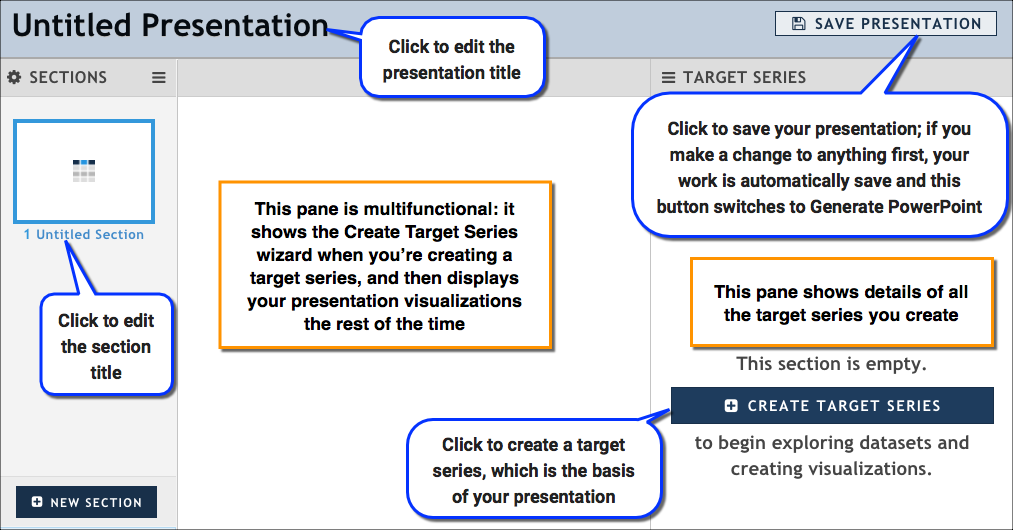
Rename your presentation:
- Click Untitled Presentation at the top of the report. The name changes to a text box.
- Type Atlanta BMW Sales, and click OK. Notice that your presentation is automatically saved when you give it a title. From this point forward, any work you do is automatically saved.
Add Data
In the Target Series pane, click Create Target Series to open the Create Target Series wizard. This is where you will specify everything you need for your target series, including the dataset, the target, and the attributes you want to group by.
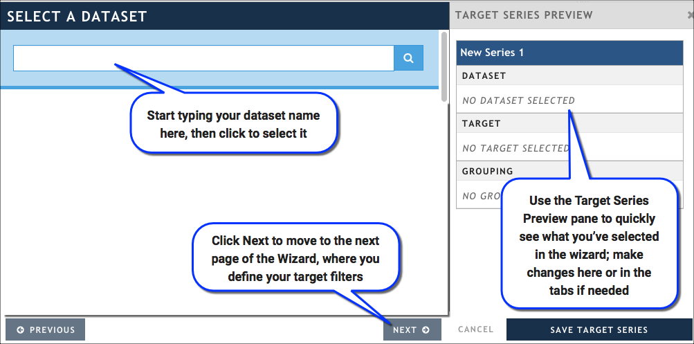
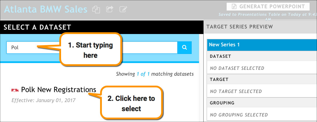
In the Select a Dataset tab, start typing Polk New Registrations, then select it when it appears in the list. You are automatically moved to the Select a Target page in the wizard.
In the Select a Target page, define the set of information you’re interested in looking at.
In the Date section, accept the default value RYTD - Rolling Year to Date from the Predefined Date Range field.
In the Dataset-based tab, select the Make attribute, and then type BMW. This limits the results we get to BMWs.
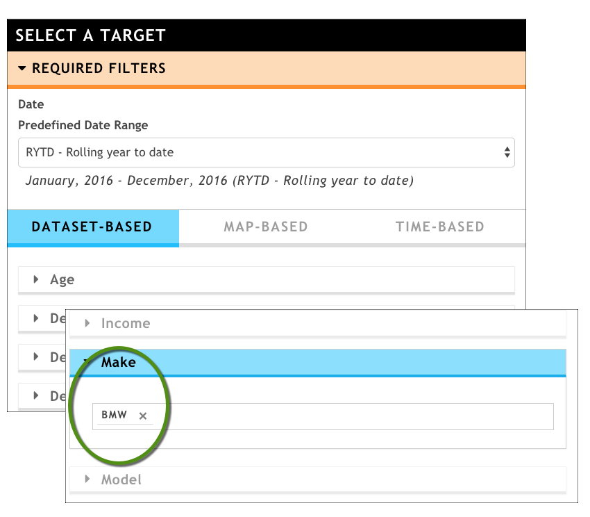
Setting the Make attribute to specify the brand of car we want to look at (click to enlarge)
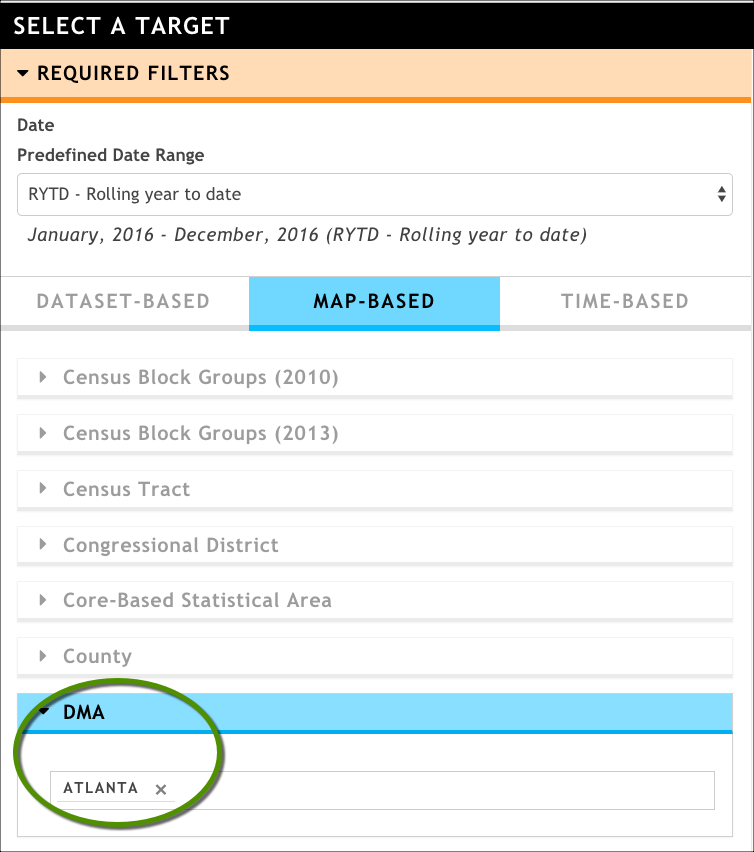
In the Map-based tab, select the DMA attribute, and then type Atlanta. By setting the DMA attribute, we are limiting the registrations to only those that occurred in the Atlanta DMA.
Our target series looks like this so far:
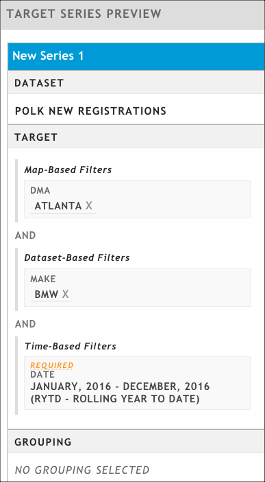
Click Select a Grouping to move to the last page in the wizard.
In the Select a Grouping tab, specify how you want to group -- or categorize -- the results that are returned.
In the Dataset-based tab, click Dealer Name. This means that you’ll be looking at all of the RYTD BMW sales in Atlanta, broken out by dealer name.
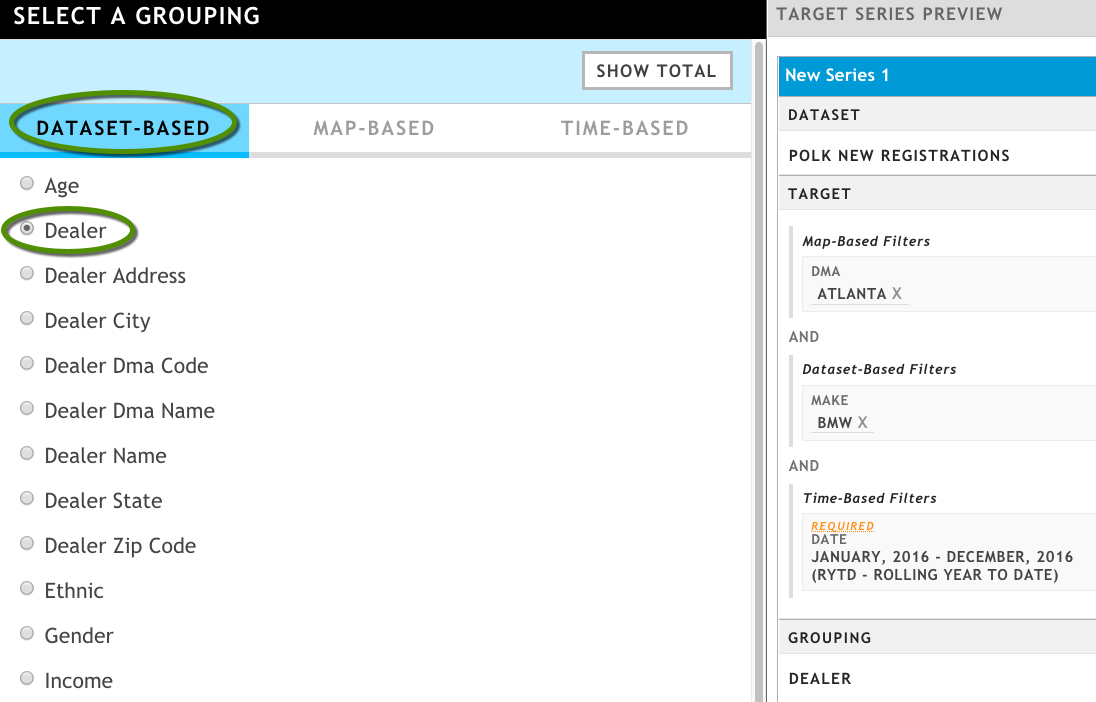
In the Target Series Preview pane, click New Series 1 to make it an editable text field, and then give the target series this name: Atlanta BMW Sales: RYTD.
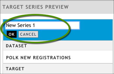
Click Save Target Series in the bottom of the Target Series Preview area. The series configuration wizard closes and you are returned to the main body of your presentation.

Click Update Presentation. By default, generates a table visualization with the results of your query. However, the table visualization is a bit small by default and displays only a few rows. We'll need to configure it.

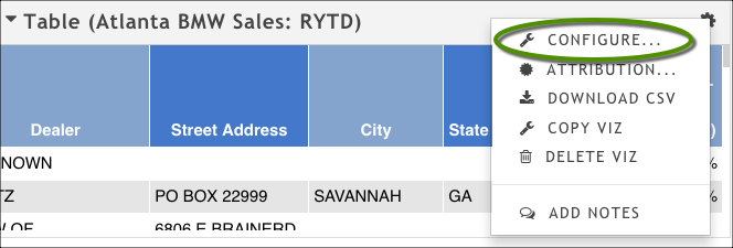
From the table's gear menu (top right corner), click Configure to open the configuration dialog box.
In the General tab, clear the Limit number of rows shown option and set the Table Height to 2.50X.
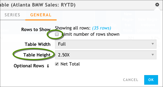
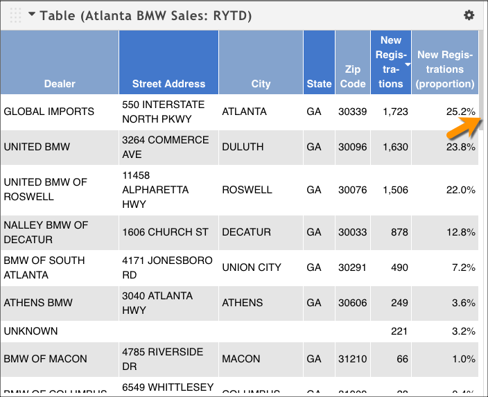
Click OK. The result table is improved, and even more so if we click the New Registrations column to sort by number of registrations. We still can't see all of the rows of data, but there is a scroll bar available. At the end of the table is a Net Total row that shows all of the new BMW registrations in the Atlanta DMA.
Visualize the Data
In this section, we're going to add a Column chart to show a subset of the data: The top 5 BMW dealers in Atlanta. It complements the table we already have.
Click Add Viz → Column Chart to add a new visualization.
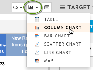
Again, our column chart is too small and contains too many data points (it's showing us all of the BMW dealers in the Atlanta area).

We're going to configure the chart to show only the top dealers who have significant sales.
Let's make this chart a little more aesthetically pleasing by adding a title, rotating the labels on the X axis, removing the statistically insignificant dealers, and adding numeric labels to help us see the actual number of registrations each dealer has.
Click Column Chart at the top of the chart to make the name editable; type Top 5 BMW Dealers.
From the chart’s gear icon (in the top right corner), click Configure.
In the General tab of the configuration dialog box, change the Chart Height to 2.0X.
In the Series tab of the configuration dialog box, click Labels > Show Labels.
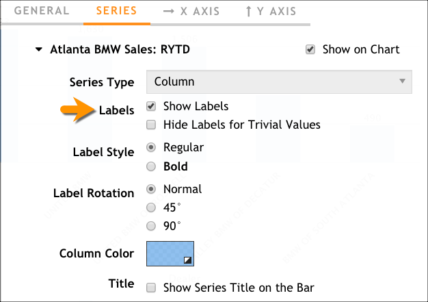
In the X AXIS tab of the configuration dialog box, make the following changes:
- Adjust the Label Rotation to 45 degrees.
- Change Sort By to
- Ensure the results are sorted in descending order (that is, those dealers with the most sales are shown on the left of the chart).
- Use the Items to Show field to specify that you want to see only the top 5 dealers in Atlanta.
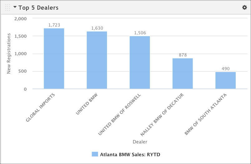
Click OK. Now our column chart looks much cleaner. We’ve lost many dealers who have had anywhere between a few hundred to a handful of sales, but that’s okay since the full set of data is represented in the table visualization.
Export a PowerPoint Presentation
Create a PowerPoint version of your presentation by clicking Generate PowerPoint at the top of the screen.
When your presentation has finished generating, you can download it by clicking Download PowerPoint.
Congratulations! You've just created your first presentation. (Hint: If you want to find it later, you can always head to the Presentations tab and look for the presentation named BMW Sales: Atlanta.)