Let's create a more advanced presentation in Rhiza Premium to introduce you to powerful capabilities that allow you to compare target series with different datasets and groupings in the same section of a presentation.
In this presentation, we still want to see which dealers sold new BMWs in 2016 in the Atlanta DMA. However, we also want to know more information about the Atlanta market for BMWs. In particular, we'll use the Polk dataset to look at which models sell best, and then we'll use the Nielsen Scarborough Local Market dataset to look at the behavior of buyers in the market. We'll use three visualizations (a table and two charts) to examine the data, and then save the presentation as a Microsoft PowerPoint file that can be shared with others.
Create a New Presentation
Log in to Rhiza.
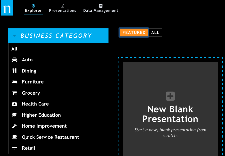
Click New Blank Presentation to start a new presentation.
When the new presentation opens, it looks like this. Note the following key areas you'll be using in this tutorial.
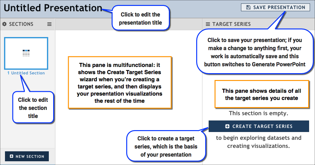
Rename your presentation:
- Click Untitled Presentation at the top of the report. The name changes to a text box.
- Type Atlanta BMW Sales, and click OK. As soon as you make this change, the presentation is saved and any further work you do is automatically preserved.
Add Data
In the Target Series pane, click Create Target Series to open the Create Target Series wizard. This is where you will specify everything you need for your target series, including the dataset, the target, and the attributes you want to group by.
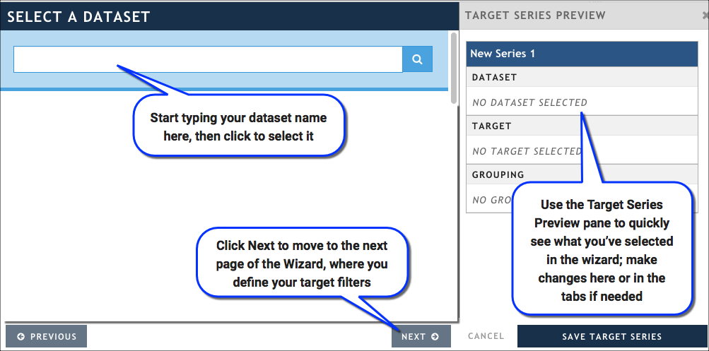
In the Select a Dataset tab, start typing Polk New Registrations, then select it when it appears in the list. This wizard automatically moves you to the Select a Target tab and selects Rolling Year To Date as your Date filter value. This isn't what we want, so we'll fix it in the next step.
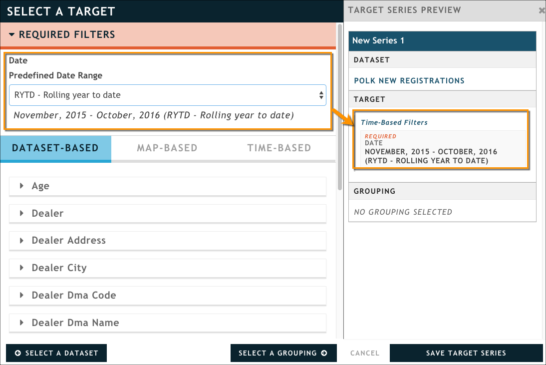
In the Select a Target tab, define the set of information you’re interested in looking at.
- In the Date section, select Custom from the Predefined Date Range field.
- Use the Starting Date field to select January 2016 and the Ending Date field to select December 2016.
- In the Dataset-based tab, select the Make attribute, and then type BMW.
- In the Map-based tab, select the DMA attribute, and then type Atlanta.
Click Select a Grouping to move to the next page in the wizard.
In the Select a Grouping tab, specify how you want to group -- or categorize -- the results that are returned. Here, we want to select the Dealer Name attribute from the Dataset-based tab. This means that you’ll be looking at all of the 2016 BMW sales in Atlanta, broken out by dealer name.
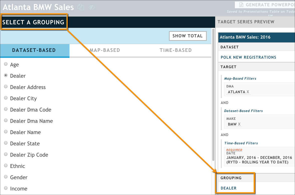
In the Target Series Preview pane, click the title New Series 1; it turns into an editable text box. Change the name of your target series to Atlanta BMW Sales: 2016.
Click Save Target Series in the bottom of the Series Summary area. The series configuration wizard closes and you are returned to the main body of your presentation.
Click Update Presentation. By default, generates a table visualization with the results of your query. As you can see, all of the dealers and their registrations are shown in the table; you can click any column header to sort the table that way. Notice that the table visualization defaults to a short height (1.0X) and displays only a few rows of data, with a scroll bar on the right side to see the rest. We will fix this next.
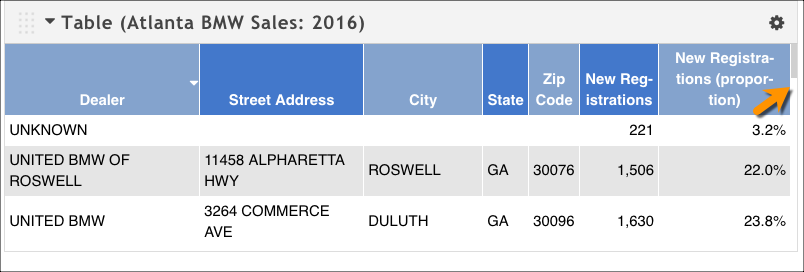
Customize the table's configuration:
Click the table's gear menu (top right), and then click Configure.

In the General tab, clear the Limit number of rows shown option so we can see all the dealers.
Set the Table Height option to 2.50X.
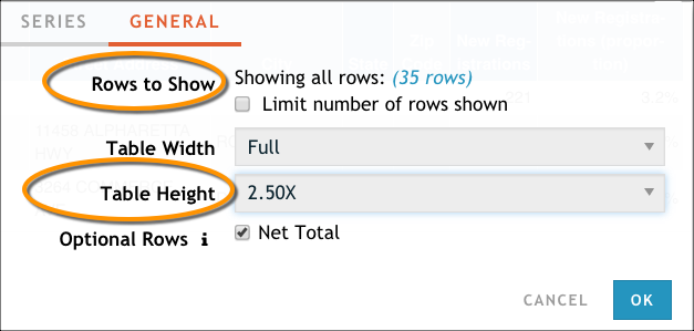
Click OK to exit the configuration dialog box.
Click Table at the top of the visualization to make the title editable, and then type BMW Sales By Dealer.
Add a Second Target Series
Let's add a second target series to look at Atlanta BMW sales with a different grouping. Instead of seeing the number of registrations broken out by dealer, let's look at what models are selling best in this DMA. We can accomplish this quickly by using the Copy Series function and making a quick edit to the target series Group By tab.
In the Target Series pane, click the gear icon next to our Atlanta BMW Sales: 2016 target series, and then click Copy Series. The Create Target Series wizard opens; it's pre-populated with the information from the original target series.
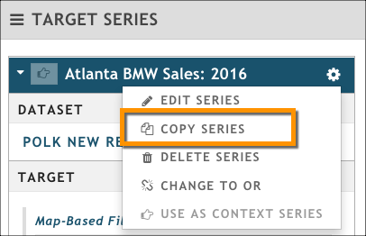
In the Target Series Preview pane, update the title from Atlanta BMW Sales: 2016 (Copy). to Atlanta BMW: Top 2016 Models.
Since we don't want to change anything about the target, click Select a Grouping at the bottom of the wizard.
On the Select a Grouping tab, click Model, and then click Save Target Series. The Create Target Series wizard closes.
ClickUpdate Presentation. You'll notice that nothing happens in the visualization pane, although did create the target series and return the results. We need to explicitly add a visualization now, so let's move on to the next section.
Visualize the Data
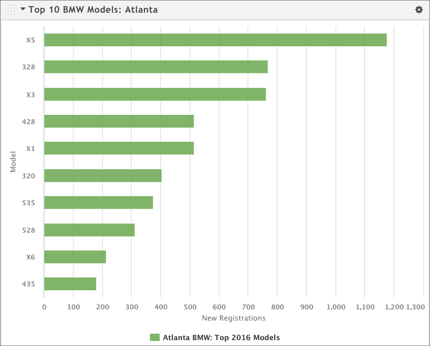
We have a basic table that shows the data for the first target series (Atlanta BMW Sales: 2016) we defined; in this section, we're going to add a bar chart that shows the results of the second target series (Atlanta BMW: Top 2016 Models). In addition, we're going to configure the chart to show only a subset of the data; instead of showing all 29 of the models sold in Atlanta, we want to see just the top 10.
Click Add Viz → Bar Chart at the top of the report to add a new visualization. (Hint: If you don't see the Add Viz button, hover over the area to make it appear.)
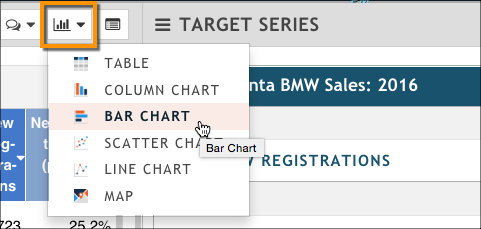
After the chart loads, you’ll notice that it defaults to the original target series, and that it's also too short to display all the data. We'll need to do some configuration.
From the chart's gear icon, click Configure.

In the configuration dialog box's General tab, adjust the Chart Height option to 2.50X.
On the Series tab, click Show on Chart next to the Atlanta BMW: Top 2016 Models target series.
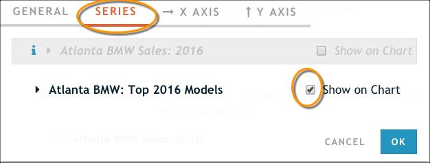
Click OK to apply the changes. You'll notice that the bar chart doesn't have a descriptive name, it shows all results by default (many of which represent only a low number of registrations), and that the bars are not a very eye-catching color. We need to do a little more configuration to make this chart tell the story we want.
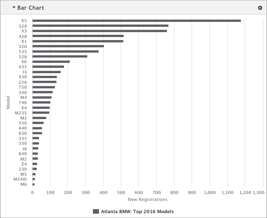
Open the configuration dialog box again by using the gear menu, and navigate to the Series tab.
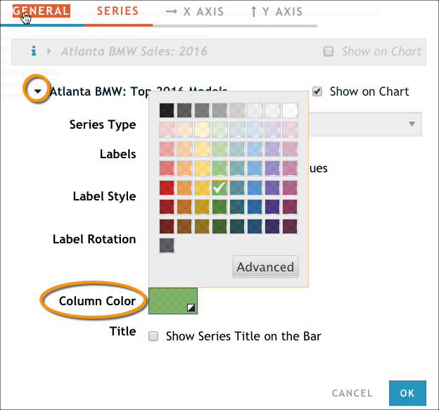
Expand the Atlanta BMW: Top 2016 Models target series and change the Column Color option to a color that's a little more appealing than dark gray.
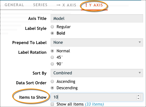
On the Y Axis tab, clear the Show all items option, and then type 10 into Items to Show. This allows us to specify that we want to see only the top 10 makes (it's used in conjunction with the Data Sort Order field above).
Click OK to close the configuration window.
At the top of the bar chart, click the Bar Chart heading to make it an editable text field.
Retitle the chart Top 10 BMW Models: Atlanta, and then click OK.
Our new bar chart should look something like this:
Add a Target Series to Examine Buyers' Behavior
Now that we know how many BMWs were sold in 2016 and what the top 10 models were, let's learn a bit about the buying habits of those people who plan to purchase a BMW in the Atlanta market. This information might be helpful in building a solid marketing strategy for a dealership. Because the Polk dataset does not contain behavioral information, we need to turn to the Nielsen Scarborough Local Market dataset to create this target series.
In the Target Series pane, click Create Target Series.
In the Select a Dataset page, type Scarborough Local Market, and then click to select it. The wizard automatically moves you to the Select a Target page.
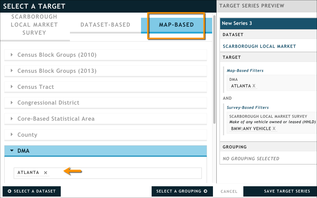
Define a target as people who own or lease a BMW in the Atlanta DMA:
In the Scarborough Local Market Survey tab, start typing Make of any vehicle owned or leased (HHLD) in the search box; the list of attributes will narrow down until only this one is available. (Hint: If the search has trouble finding this question, you can look for it under the Automotive category.)
Click BMW: Any Vehicle from the list of answers.
From the Map-Based tab, set the DMA attribute to Atlanta.
Click Select a Grouping to move to the next page in the wizard. We want to define a grouping that lets us see our target broken out by a particular question in the Scarborough Local Market dataset that asks them why they used the dealer they did when purchasing their BMW.
In the Scarborough Local Market Survey tab, start typing Primary reasons usd dealer to buy/leas last used vhcl (HHLD) in the search box; the list of attributes will narrow down until only this one is available. (Hint: If the search has trouble finding this question, you can look for it under the Automotive category.) Note that there are two attributes with the same name but a different number of answers; pick the one with 10 answers (shown in the graphic below).
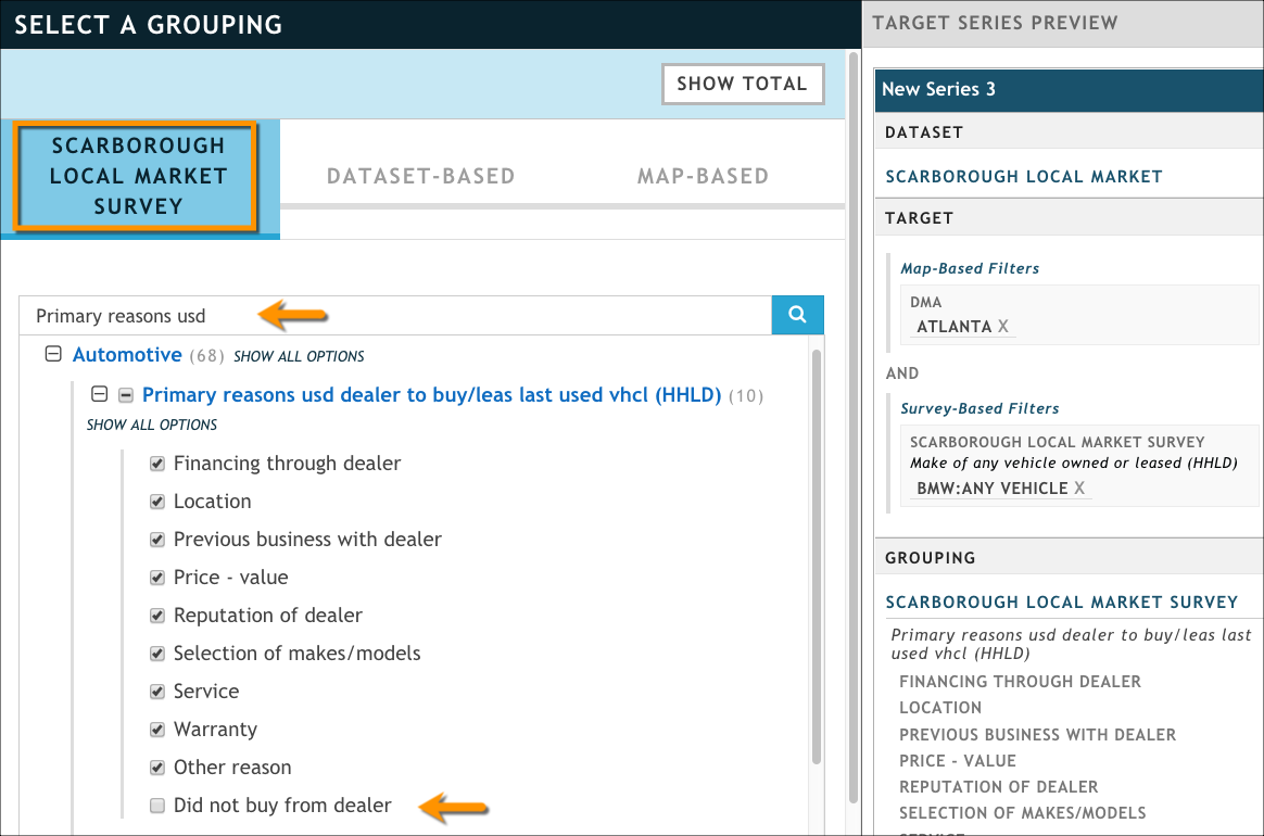
Select all of the answers except Did not buy from dealer.
In the Target Series Preview pane, click New Series 3 to make it an editable text box, and then rename your target series Atlanta BMW: Buyer Behavior.
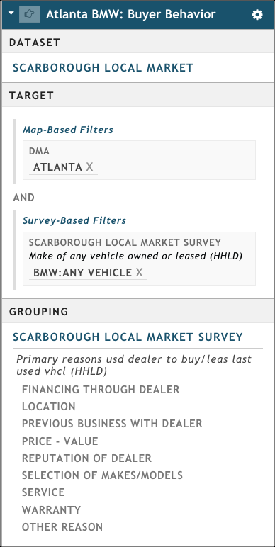
Click Save Target Series to close the Create Target Series wizard.
Click Update Presentation in the visualization pane. Remember: After the initial target series, doesn't give us a visualization. We'll have to add one.
Add and configure a visualization to show the data we just returned about our BMW buyers:
Click Add Viz → Column Chart at the top of the presentation to add a new visualization. As before, the chart defaults to showing the first target series we defined, so we need to configure it.
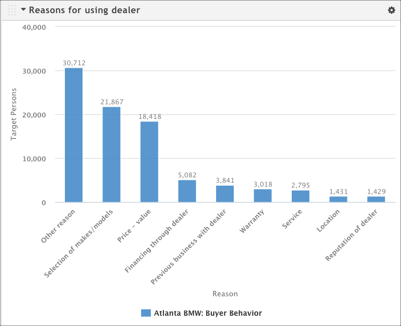
Click Column Chart at the top of the viz to open the editing box and type the title Reasons for using dealer.
From the chart's gear icon, click Configure to open the configuration dialog box and make the following changes:
On the General tab, set the Chart Height option to 2.50X.
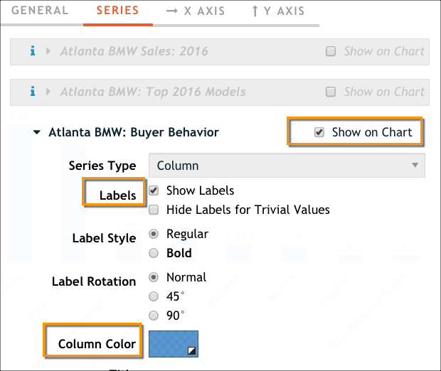
On the Series tab, click Show on Chart next to the Atlanta BMW: Buyer Behavior target series, and then click Show Labels. You can also set a new color for the columns if you want.
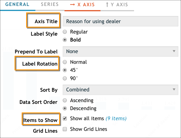
On the X Axis tab, set Label Rotation to 45° and update the Axis Title to read Reasons for using dealer.
On the Y Axis tab, set the Data to Display to Total Persons. (When dealing with a survey-style dataset that has weighted values, we recommend using that rather than the actual respondent count. For more information about what these terms mean, see Nielsen Scarborough FAQs.)
Click OK to close the configuration box. Our chart looks much cleaner now.
Format Your Section
Right now, our three visualizations are stacked one on top of the other, with the most recent visualization on top. For the sake of this tutorial, let's say that we need to move the table and bar chart so they are next to each other, and then move the new column chart underneath those two.
To give ourselves more working space, use the hamburger icons to close the Sections pane and Target Series pane.

Use the configuration dialog box to set the BMW Sales by Dealer table visualization's Table Width option to Half. (You can find it on the General tab, as shown in the screen capture below.)

Use the configuration dialog box to set the Top 10 BMW Models: Atlanta bar chart visualization's Chart Width option to Half.

Notice that the two visualizations are automatically placed side-by-side.
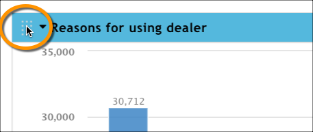
Grab the handle on the top left of the Reasons for Using Dealer column chart and drag it underneath the other two visualizations.
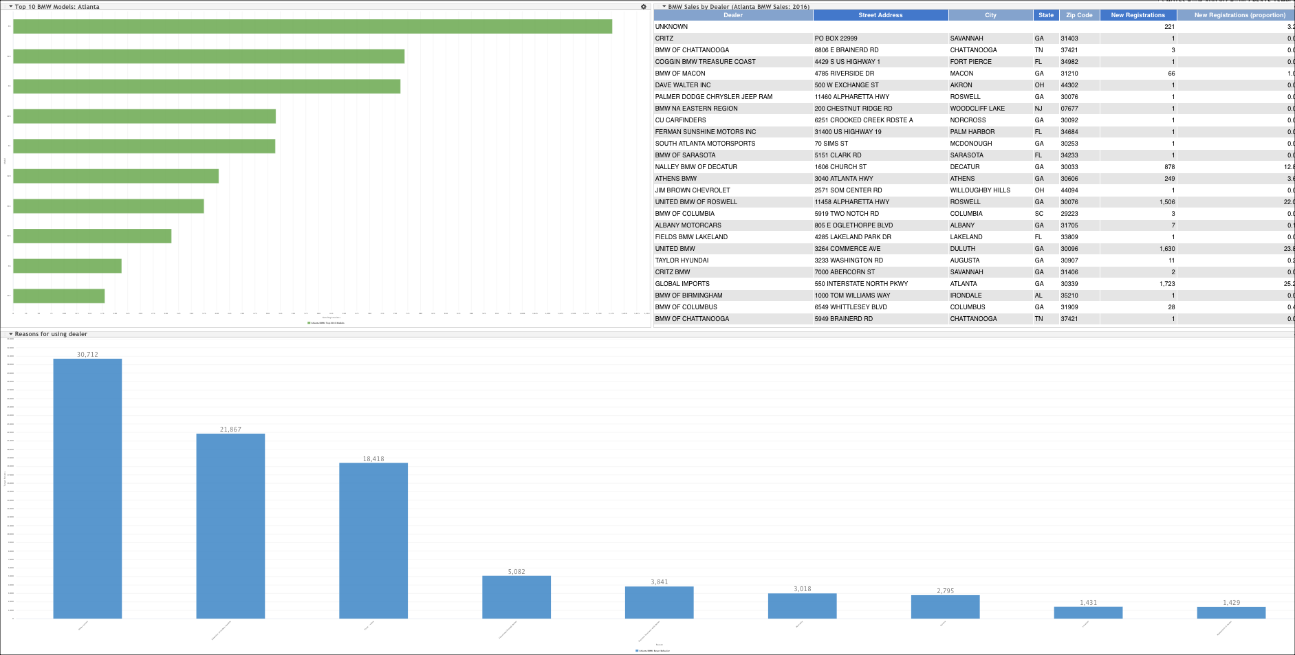
Our finished presentation might look something like this. (The screen capture has been zoomed out so that it fit on the screen.)
Export a PowerPoint Presentation
Create a PowerPoint version of your presentation by clicking Generate PowerPoint at the top of the screen.
When your presentation has finished generating, you can download it by clicking Download PowerPoint.