In this example, we're going to use the AggData Premium dataset to plot all of the locations of In-N-Out Burger in the Los Angeles Nielsen Radio Metro Area.
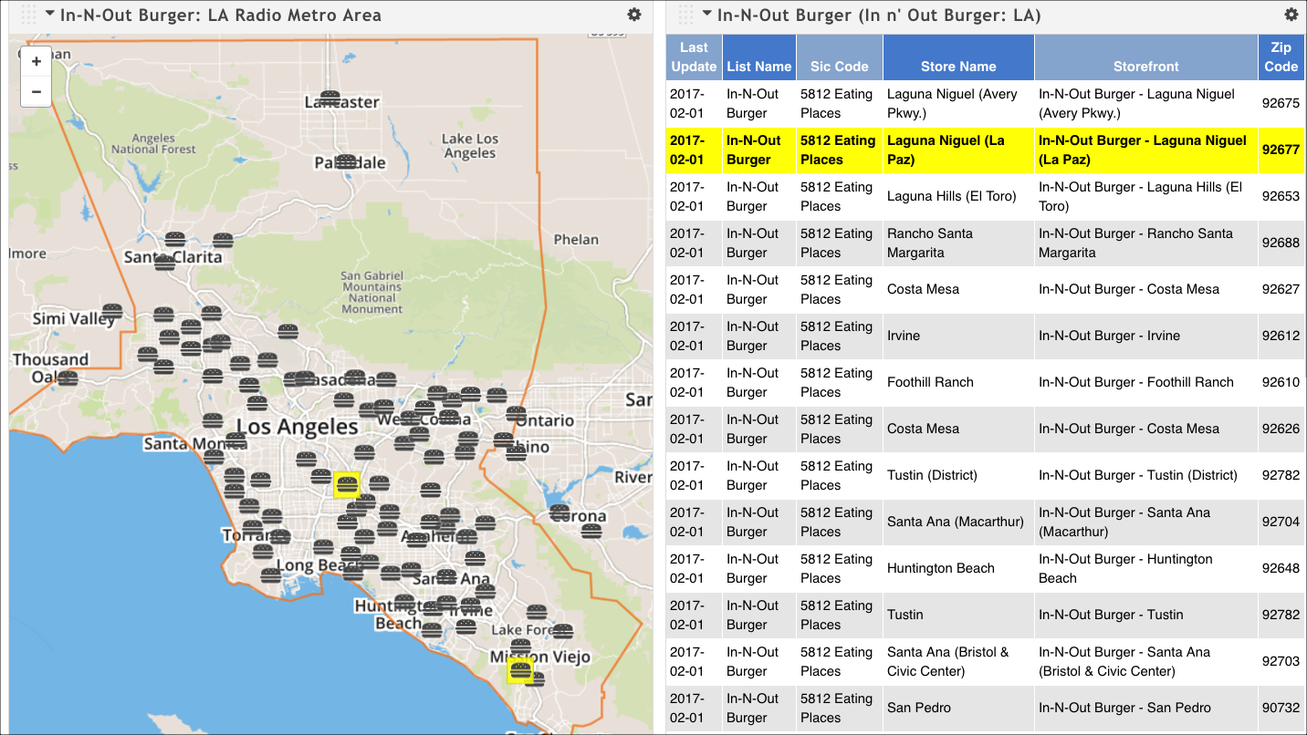
When we're done, we'll have a map and a table that looks similar to this. Notice that you can click on any location on the map and see its detailed information in the table; this is a feature called coordinated highlighting. You can also do the reverse: click on a location in the table and see the corresponding map point highlighted.
Open a new presentation.
Click Create Target Series to open the Create Target Series Wizard.
On the Select a Dataset page, start typing AggData, and then click AggData Premium when it appears as a choice of datasets. The wizard immediately moves you to the Select a Target page.
In the Company Name attribute field, start typing In-N-Out Burger. The system will return matching results as you type; select In-N-Out Burger by clicking it.

Switch to the Map-Based tab.
In the Nielsen Radio Metro Area attribute field, start typing Los Angeles. The system will return matching results as you type; select Los Angeles by clicking it.
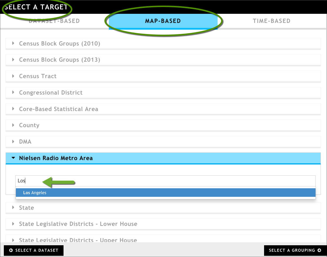
Click Select A Grouping at the bottom of the wizard to move to the next page.
On the Select a Grouping page, click Records from the Dataset-Based tab.
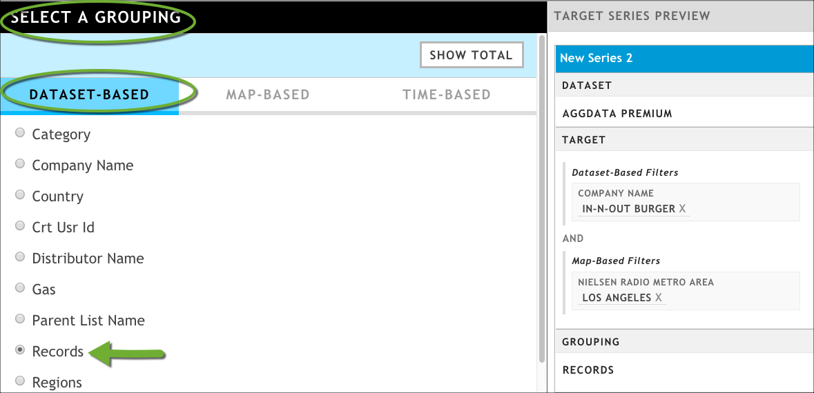
In the Target Series Preview Pane, rename your target series by clicking New Series 1 to make the text box editable, entering a new value, and then clicking OK.
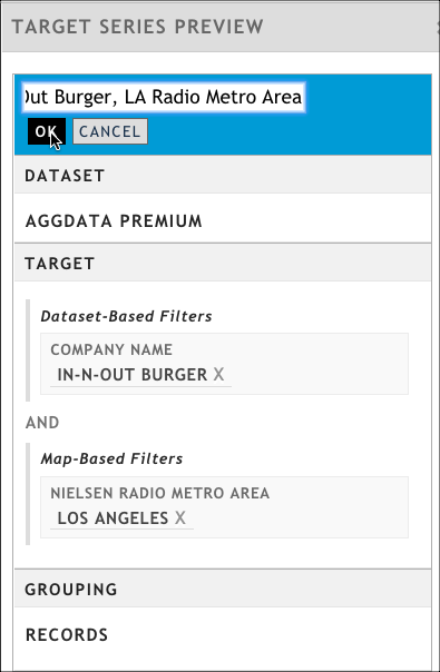
Rename a target series by clicking the default name to create an editable text box
Click Save Target Series.
Click Update Presentation to add the table visualization. This table lists all of the In-N-Out Burger locations in the Los Angeles Radio Metro Area and provides detailed address information for each location.
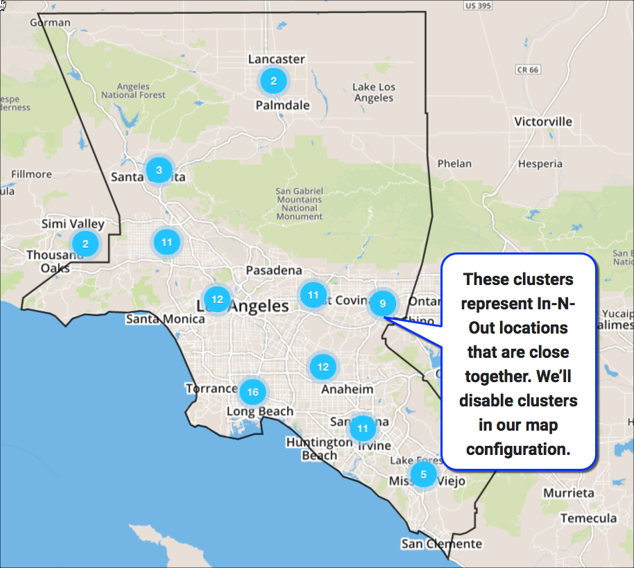
Add a map visualization. Notice that by default, it shows clusters of In-N-Out burger locations. uses cluster markers on maps when there are several business locations close together. We can -- and will -- disable this feature in the next step so we can see individual locations.
Configure the map as follows:
In the General tab of the configuration dialog box, set the map's width to half. For more information, see Adding and configuring visualizations.
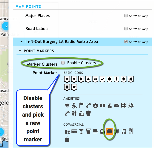
In the Series and Map Layers tab, expand your target series, and then expand the Point Markers section.
Disable the Marker Clusters → Enable Clusters option.
Set a new icon for the Point Marker.
Click OK.
Configure the table visualization so that it is the same height and width as the map, and it displays all rows of data.