A grouping is a type of data filter; it categorizes (or aggregates) the data series results by a particular characteristic. That characteristic might be temporal (for example, aggregating results by month, year, or quarter), geographic (for example, aggregating results by state, ZIP code, or target market), or demographic (for example, aggregating by age, gender, income, or other personal traits).
When you are adding data to your Report, you specify the group when you are creating the target series.
Before You Begin
Make sure you've created a new presentation and defined the dataset you are using. See [Create a Target]({$ link content/create_use_dataseries.md %}).
Steps
Make sure the Create Target Series wizard is open to the Group By tab.
Right away, you can decide whether you want to group your results or simply show the total values for the results:
Define Data Groupings: This option lets you define the attribute or set of attributes you want to use to group (or categorize) your target. For example, if you defined your target in your data series as the registrations for a specific auto dealer, you can group the results by attributes like model or ZIP Code or date. This allows you to examine your target in the context of some other, relevant factor.
Show Totals: This option lets you skip grouping your results. Instead, all of the data for the target data series are returned, and they are not categorized by any attribute. If you choose this option, skip to Step 3.
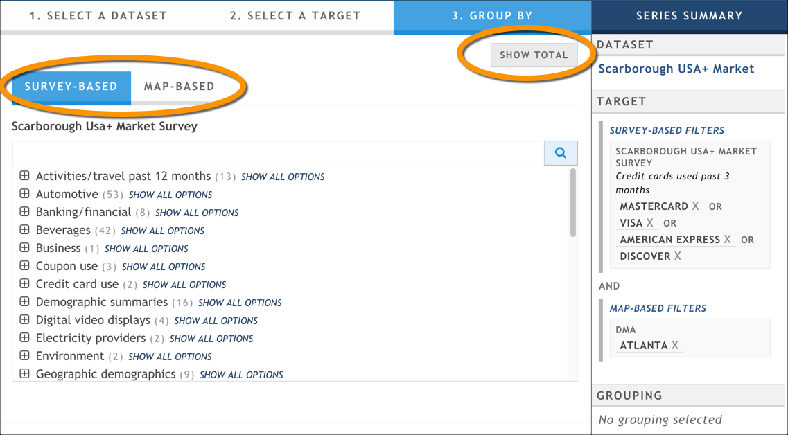
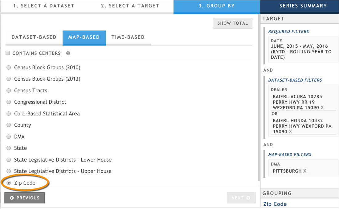
If you selected Define Data Groupings, use the sub-tabs to select the grouping option you want to use. There are multiple tabs, depending on the dataset you are using:
- Dataset-based or Survey-based: Use this tab to select a grouping that is specific to the dataset you're using (for example, the make of a car, if you're using an automotive registration dataset).
- Map-based: Use this tab to select a grouping based on a geographic series (for example, a ZIP Code, county, or target market).
- Time-based: Use this tab to select a grouping based on a time period (for example, a year, a month, or a quarter).
If you are using a non-survey-style dataset (for example, IHS Polk), you can group to only a single attribute.
If you are using a survey-style dataset (for example, a Nielsen Scarborough product), you have more flexibility:
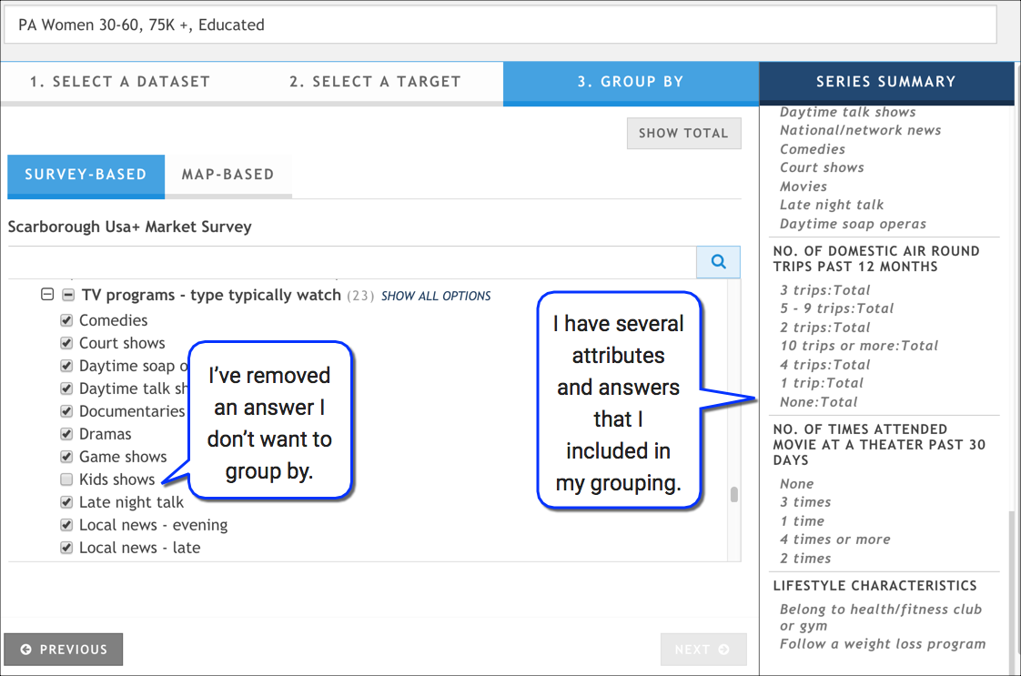
- Select only certain answers from an attribute (question): Previously, all answers were selected; often, it placed unwanted data on visualizations, especially when there were answers like "none."
- Select answers from different attributes (questions): Previously, you could aggregate to only a single attribute. Now, you can select as many different attributes -- and as many (or as few) answers for each attribute -- as you want. These attributes can be from any combination of the sub-tabs on the Group By tab.
The following graphic shows an example of flexible grouping with a subset of answers from four different attributes, or questions.
 There are several options for how you group -- or don't group -- the data you've defined in your data series. How do you know what to pick?
Grouping Tips
We encourage you to experiment a bit with the different options to see the various stories you can tell by aggregating your data to different attributes. However, we also want you to understand when and why you might use some of these options. First, let's look at a table of when you can use each option:
| Grouping Option | User-uploaded dataset | IHS Polk dataset | Survey-style dataset (e.g., Nielsen Scarborough) |
|---|---|---|---|
| Define Data Groupings - single attribute | Supported | Supported | Supported |
| Define Data Groupings - flexible groupings | Supported | ||
| Show Totals | Supported | Supported | Supported |
When to use Define Data Groupings - single Attribute
- When your dataset does not support flexible groupings
- When you want to aggregate to only a single attribute
- When you want to aggregate to all of the values within an attribute (this is often true with attributes that have very few values, such as sex of respondent, or that have a small number of highly relevant values, such as level of education or race)
- When you want to explore the data; once you find information you want to dig into, use flexible groupings to refine your results (assuming your dataset supports flexible grouping)
When to use Define Data Groupings - Flexible Groupings
First, let's define what flexible groupings means. Whereas in the previous option you were restricted to aggregating to all of the values in a single attribute, with flexible grouping, you can:
- Select only certain answers from an attribute (question): Previously, all answers were selected; often, it placed unwanted data on visualizations, especially when there were answers like "none."
- Select answers from different attributes (questions): Previously, you could aggregate to only a single attribute. Now, you can select as many different attributes -- and as many (or as few) answers for each attribute -- as you want.
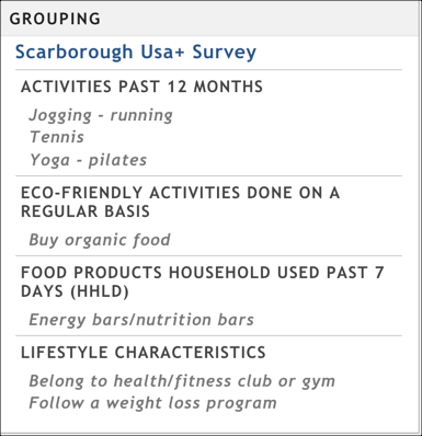
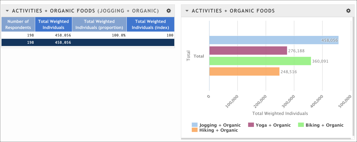
So, when would you want to use this option? Let's look at an example. Steve is researching whether certain demographics participate in healthy behaviors in a market; his research will help his healthy-lifestyle-oriented client determine how to position its ads. Steve is using the Nielsen Scarborough USA+ dataset, which scatters information about healthy living across multiple categories and questions. He can find relevant answers in questions like "Activities Past 12 Months," "Eco-Friendly Activity Activities Done on a Regular Basis," " Food Products HouseHold Used Past 7 Days," and "Lifestyle Characteristics," just to name a few. Each of these questions has many answers, and only some are applicable for the healthy lifestyle research he's doing. Steve carefully picks only those answers from the questions, and ends up with a flexible grouping that looks similar to this:
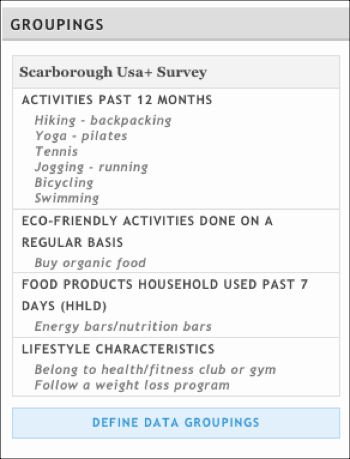
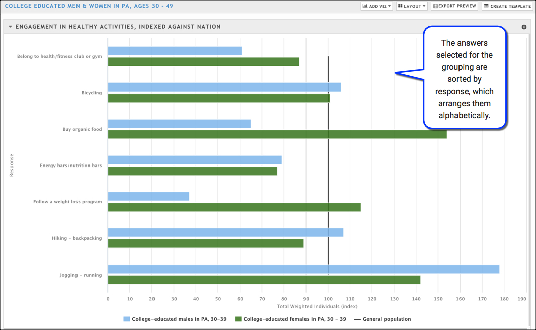
When he creates his visualization, it might look similar to this (assuming he created data series defining his target demographic, as well as a context series to compare this market's behavior to the nation). He can quickly see how health-oriented this particular target demographic is and use the findings in his client research.
When to use Show Totals
Use Show Totals when:
- You have carefully crafted multiple data series to include exactly the attributes you want to examine
- You do not want to further break out your data by applying a grouping
- You are interested in knowing only the net totals for the data series you have defined and comparing them across the series
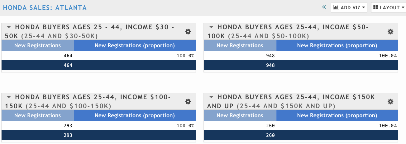
For example, let's imagine that Nicole wants to know specifically how many women in certain income and age brackets have purchased a Honda in 2015 in the Atlanta DMA. She carefully creates four different data series that will allow her to compare the total number of registrations for each target demographic she is interested in. Her data series might look something like this:
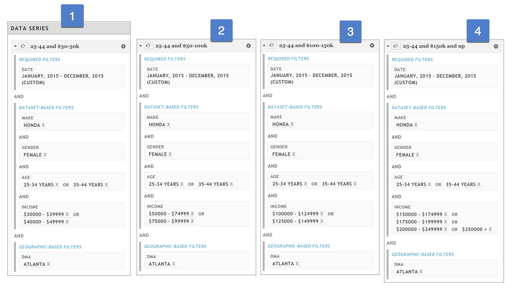
The default visualization is a table. If Nicole adds a table for each data series, she can quickly see that among Atlanta women aged 25 - 44, those who make between $50,000 and $100,000 a year account for significantly more Honda registrations than any other defined target demographic.
You can use the Show Totals option with table, column, and bar chart visualizations, and you can use one of the data series as an index. If you use a table visualization, there is only a single row, with an optional Net Total row. The Proportion column will always have a value of 100% because you are showing a single record: the total count of everything defined in your data series. Likewise, if you've defined a data series to be used as an index, the Index column will also have a value of 100%.
Three caveats about using Show Totals:
- Sample size becomes critical here. It's possible to create such a specific data series that only a few -- or no -- respondents match it (for example, a data series that specifies roller-skating nuns aged 65-99 in the ZIP Code 15213 mostly likely has no data associated with it because it's too specific).
- If you are creating a template and the Show Totals option is set, it is locked and all future presentations will be created with this option. However, if you create a template with Define Data Groupings selected, you cannot then select Show Totals in any presentation you create from the template.
- Weighted calculations are not applied when using Show Totals. This means that the value you get might differ from the value you'd get if you grouped your data series instead (for example, if you decided to aggregate them by ZIP Code or other attribute).
Grouping by Date
Rhiza includes several options for examining the data in your presentation by units of time. For example, if you have a dataset that shows what days and times people visit certain websites, you could create a presentation breaking out the data by day of the week over the course of a month to see if certain days have higher usage than other days, and whether those days might correlate with other activities (online promotions or coupons, holidays, etc.).
There are three parts necessary to configure a presentation this way:
- a dataset with time-based data
- carefully designed data series that focus on a specific date range
- a grouping that is time-based
Steps
Start a new presentation.
Select the dataset you want to use. Make sure it has time-based data.
It could be any type of information - like a number of pizzas eaten per month, pet supply sales volume per week, TV viewers per half hour, or vehicle traffic per minute.
Data that you upload yourself can be used with this system, as long as it has a calendar-based time element (year, quarter, month, week, day, hour, or minute).
This feature is still under development; not all syndicated datasets with temporal elements are currently supported. If you encounter problems, contact by using the Support link.
can aggregate data by the smallest unit in the dataset, or by larger units. That is, if your dataset reports sales by month, you can show months, quarters, and years in your report, but you can't show sales by week or day because the data isn't available at that level of precision.
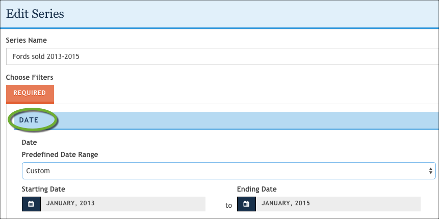
Create at least one target series with a date filter to specify the overall time period to show. In many cases, you'll want to set up multiple series with a consistent date range.
You can set different date ranges in different target series, but remember that the grouping will not include all target series if the time periods don't overlap. For example, if you break out by month, a target series that covers a full calendar year will be represented in the January category, but a target series that covers only the second quarter of that year will be missing from the January grouping. Different date ranges in target series also affect index calculations.
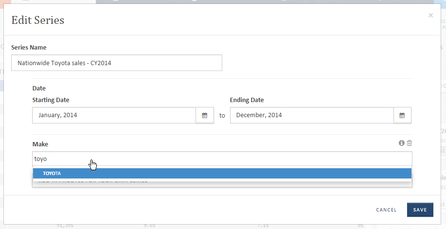
- In the Target Series section, Click Filter Data Series to open the Edit Series window.
- In the Series Name field, type a meaningful name to represent the series.
- Use the Date filter to specify the time period you want to include.
- In the Choose Filters section, add the first filter or you want to use.
- Add one or more values for the attribute.
- Add additional attributes and values until your series filters the data according to what you want to see, and then click Save.
- Repeat this process for any additional series you want to create.
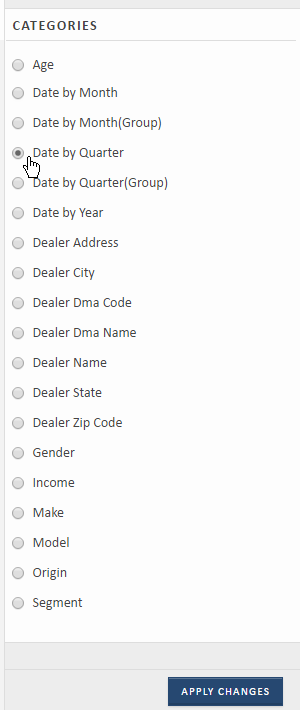
Use the Groupings section to choose how to show your data by time. In the list, the temporal categories are labeled at Date by time_element.
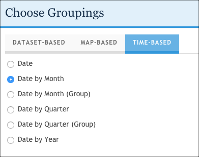
There are two options for each temporal grouping: the individual dates (for example, Date by Month) and the group date (for example, Date by Month (Group)). The group options collect data for all similar time periods in one grouping - that is, Date by Month (Group) aggregates data for all January months together.
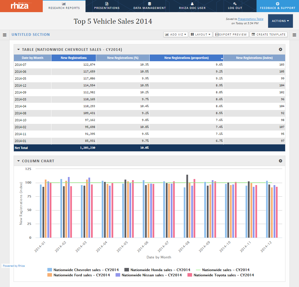
These screen shots show the same report with different aggregation groupings. The target series include the CYTD (12 months of data).
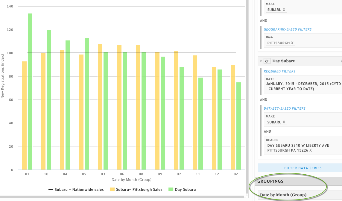
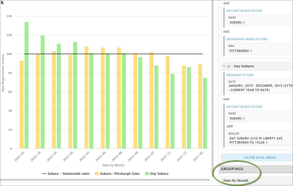
Remember that if you choose a grouped grouping, the number of months (or days or quarters) included might be different from one group to another. The example above shows 12 months of auto sales from January 2015 through December 2015.
If it showed data from a longer time period -- let's say from January 2014 through March 2015 -- the report would include two instances each of January, February, and March, but only one each for April, May, June, July, August, September, October, November, and December. If the chart showed the total number of registrations in January instead of the index values, you would expect the months with two years' worth of data to show about twice as many sales as the months with one year's data.
Click Update Presentation.
Example: Grouping by Date
This example uses a vehicle registrations dataset (for example, IHS Polk New Registrations or Experian Autocount) to show how to create a presentation that aggregates data by month.
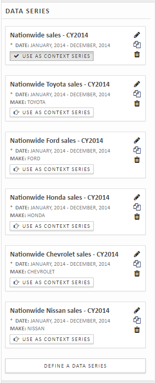
After we create a new Spectrum presentation and choose the data set, we need to create data series for each model of car we want to examine.
In this example, we'll use the same date range for each data series. After we use the date selector to set the date range for one series, we can copy and edit the series to create the rest.
We are also going to create a data series that shows all makes to use as a context series for indexing purposes.
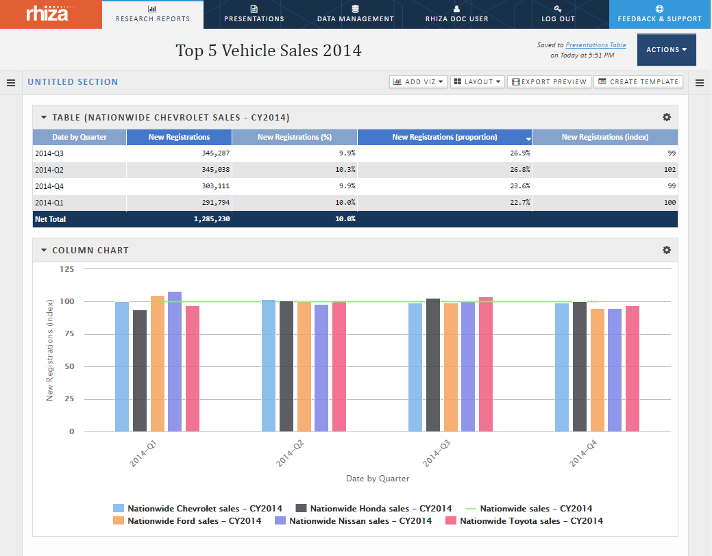
For the category, we're going to choose quarters. In this case, since the time filters in the data series cover exactly one calendar year and the data is available by month, the "group" options will give the same result as the individual options. (There is only one January and only one Q1 in the data series.)
After we do a bit of configuration on the presentation (adding and tweaking visualizations), we see the following presentation:
If we wanted to, we could easily change the category to Date By Month, click Apply Changes, and see a revised version of the presentation: