Rhiza offers different methods for digging into the data:
- Visualizations
- Calculated values
- Context series
- Aggregation by time-based, map-based, or dataset-specific categories
We encourage you to explore your information with a combination of these tools and techniques. Below are a few tips to get you started.
Tip 1: Try different visualizations to look at the target series
For an overview of visualization types, see Visualizations.
Tip 2: Use a combination of visualizations to tell the complete story
Sometimes, a combination of a table and a map works better than either one alone. Or side-by-side maps highlighting different data points can help illustrate your point. Our point: Play with the visualizations and see whether a combination of them tell a better story than a single one might.
Tip 3: Instead of using an attribute in a filter, try aggregating to it as a Grouping (or vice versa)
Get creative in how you approach the data. Maybe you think you want to create target series for different pet types and then group them by their owners' political party. Let's see what that might look like:
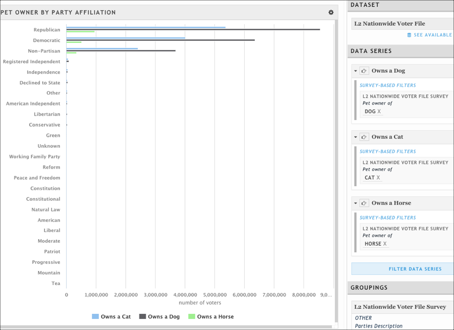
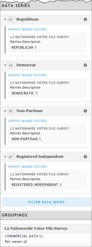
There's a lot of noise in there that we don't want, and it's coming from the grouping; there are so many responses to the question of party description. So, let's flip this around and use the party description to form our target series and the type of pet owned as the grouping.
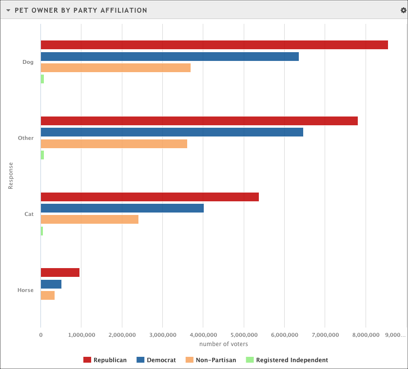
Our result might look something like this:
Tip 4: Pay attention to the sample size of the data
When you're looking at data from a survey-style dataset like Scarborough Local Market, keep in mind that these datasets use modeling techniques to extrapolate the number of responses they get to reflect the trends in a larger geographic area. We recommend that you use the weighted Target Persons and Target Households values in your visualizations, but that you first take a peek at the individual number of respondents to determine how valid the results are. The more individual respondents there are, the more valid the data.
Nielsen Scarborough considers anything with a respondent count lower than 70 to be relatively unstable and anything with fewer than 35 respondents to be unreliable.
Tip 5: Use a context series to examine your data in light of a larger entity
lets you designate one data series as the context series so you can examine your data in light of a bigger market. See Context series and Indexes for more information.
Tip 6: Understand calculated values in your visualizations
Visualizations offer different types of calculated values. See Calculated Values.
Tip 7: Know the nuances of your Dataset
How is the data collected? Is it weighted? What attributes are available? Are there any unexpected or unusual results that you might see when visualizing the data? To answer these questions, start with the Polk dataset FAQ or Nielsen Scarborough FAQs. If you don't find answers there, refer to the dataset provider's website or your dataset provider customer representative.